


XRS: XR product concept
XRS
A city can be full of stories and still give you very little help finding them. The XRS brief was to turn a broad XR vision for Serbian culture and tourism into a coherent product experience, starting from zero: location-based discovery, historical AI guides, spatial portals and play. My challenge was to make those modes feel like parts of one platform, with a clear way in, understandable controls and an obvious way back. I developed the information architecture, interaction flows and visual language as an editable product concept grounded in the original XR material.
Back to LabXR Srbija
XR product concept
Product strategy / UX / UI
AI + Figma

Visual Identity
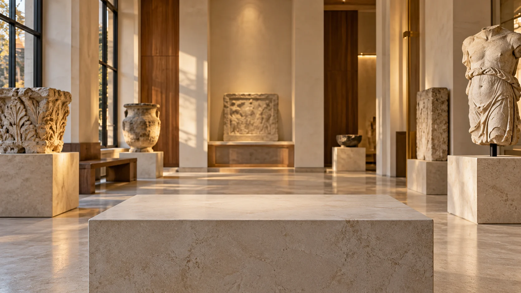
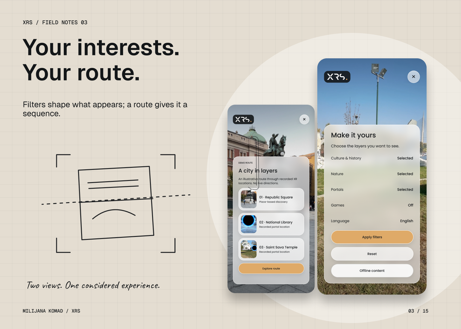
I started with a simple rule: the place should hold your attention before the interface does. I kept the original XRS mark and its black, white and warm gold character, then translated that identity into a lighter system of translucent surfaces. The camera view stays present; information arrives in compact, rounded layers that help you read the scene without covering it.
Poppins gave me a practical, human rhythm across place names, conversation controls and mission instructions. I used medium weight for decisions and regular weight for explanation, keeping the hierarchy consistent across all four modules. Gold marks the next action, while quieter glass surfaces hold context and secondary choices. The visual language gives very different experiences a shared sense of place.
- CAMERA-FIRST VISUAL HIERARCHY
- ORIGINAL IDENTITY, SHARED UI LANGUAGE
- TRANSLUCENT CONTEXT LAYERS
- CONSISTENT ACTIONS ACROSS FOUR MODULES
Colors
#131618 #DFAA68 #F0F0EC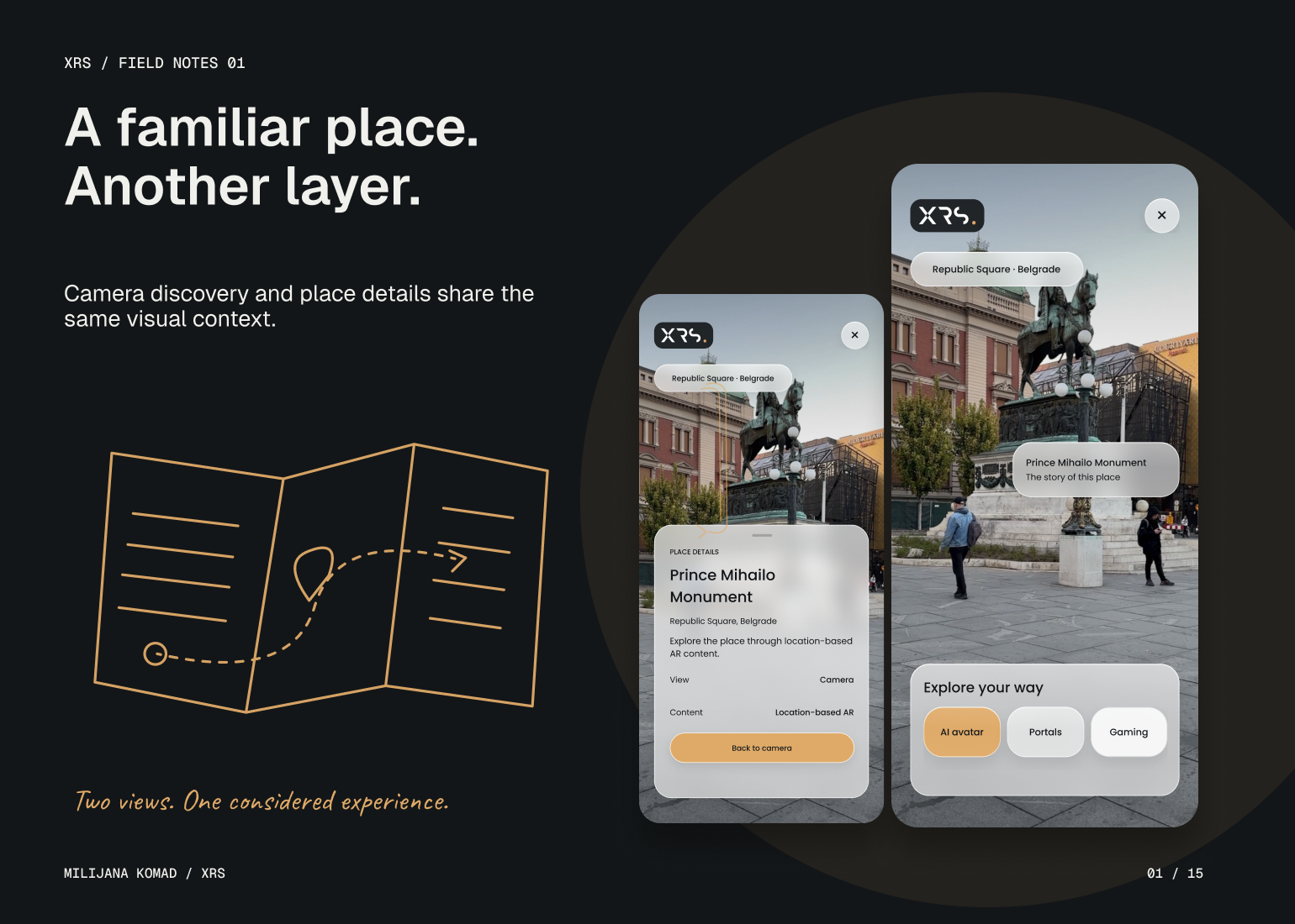
The Solution
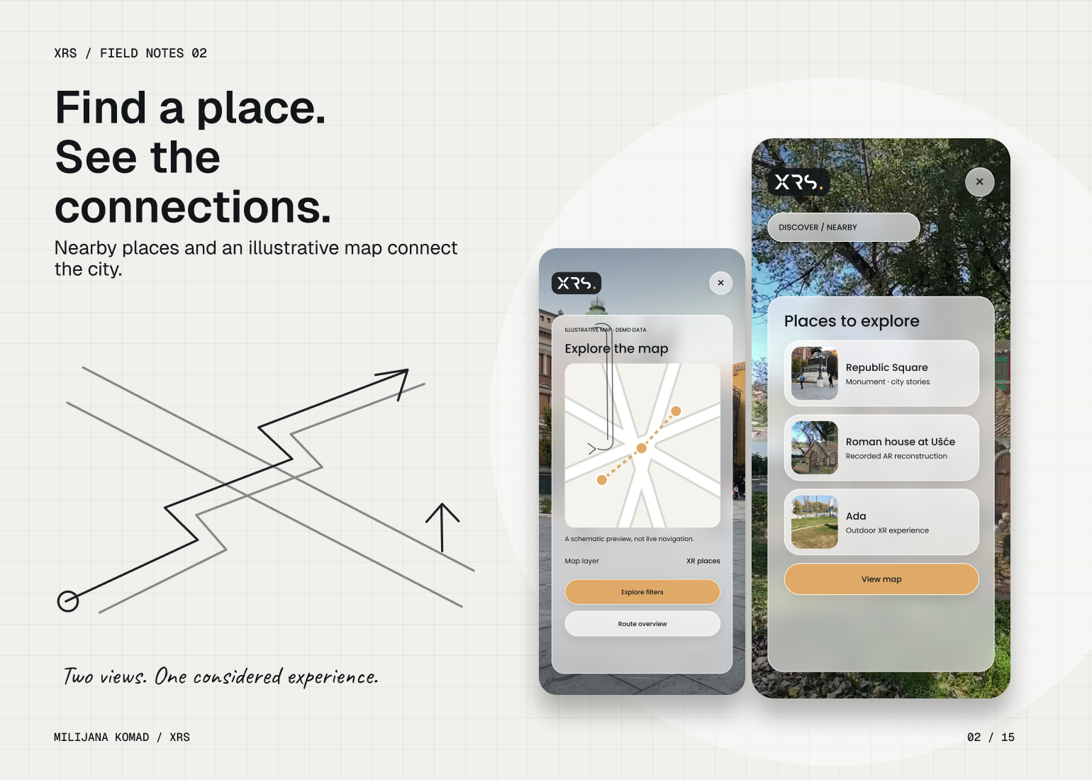
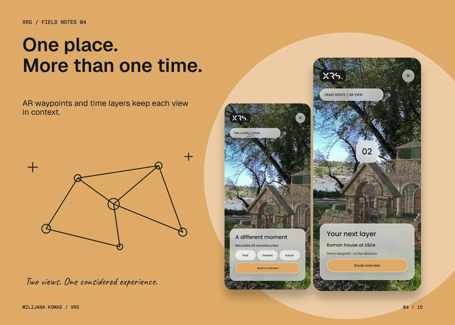
I organized XRS around the camera as a shared point of orientation, with discovery, AI conversation, portals and gaming available as distinct modes. That removed the need to explain the whole platform before someone could explore a single place. Location details, filters and route previews use the same information hierarchy, so the user can move from noticing something to understanding what is available there.
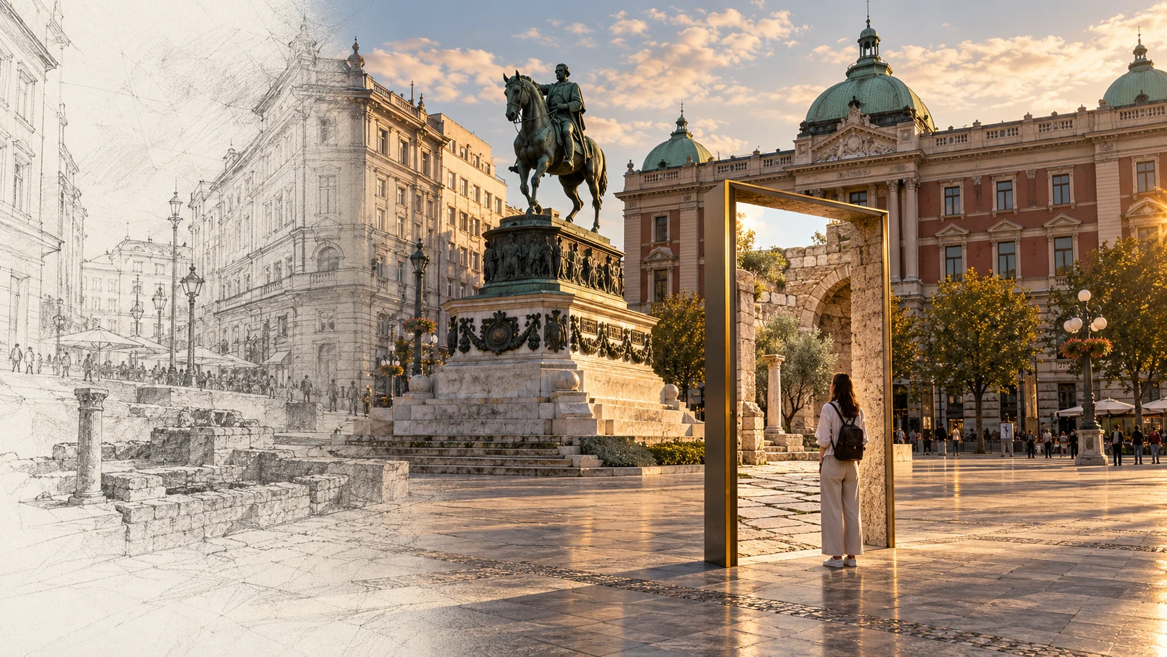
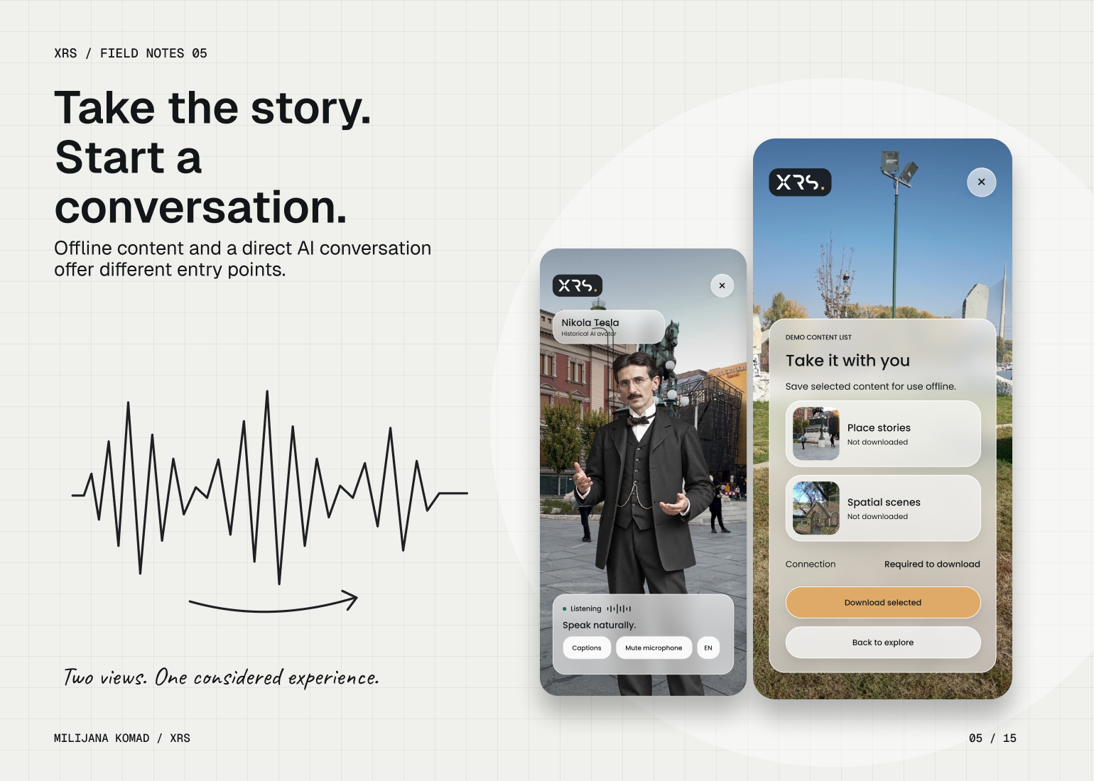
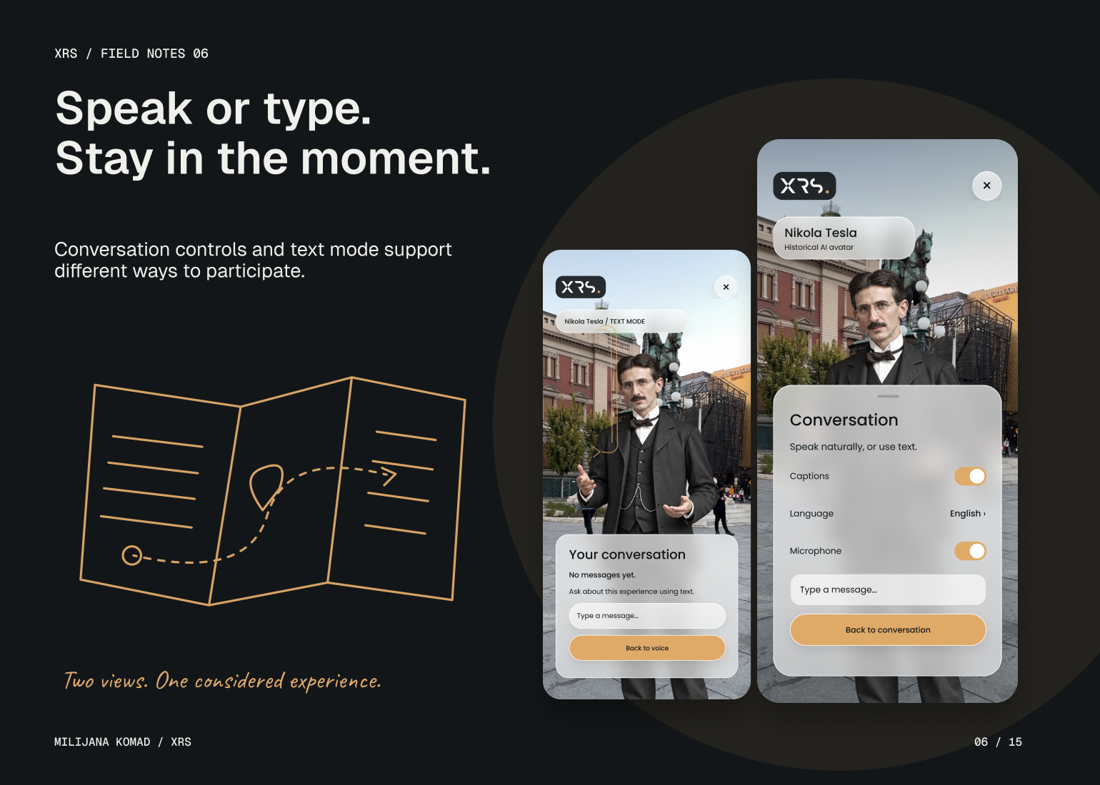
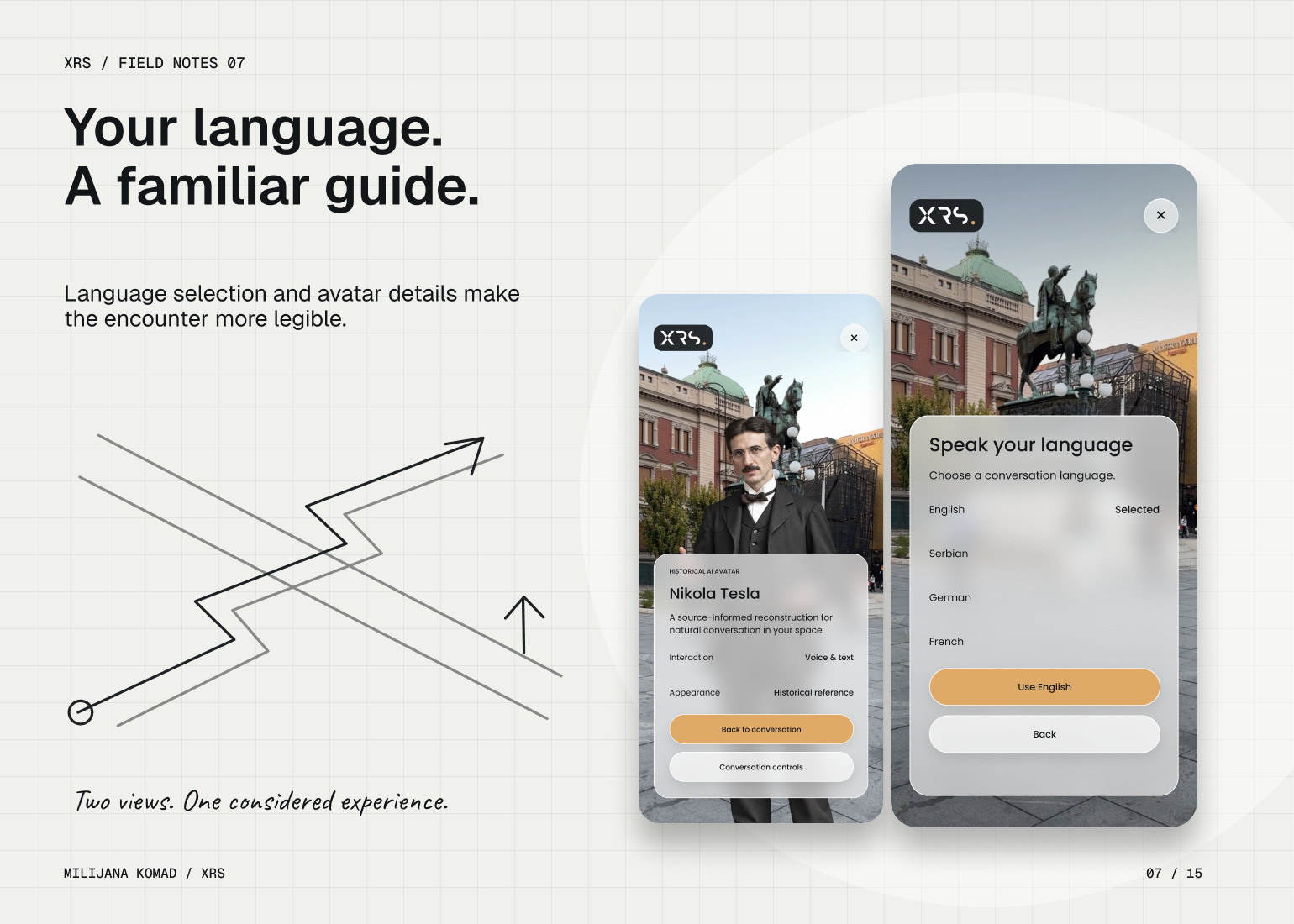
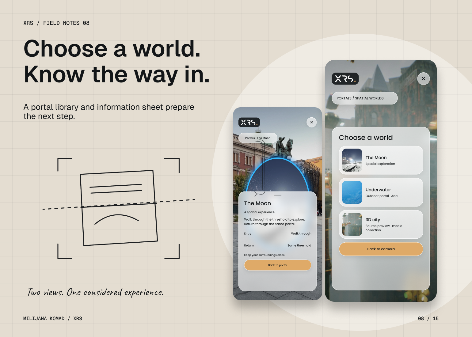
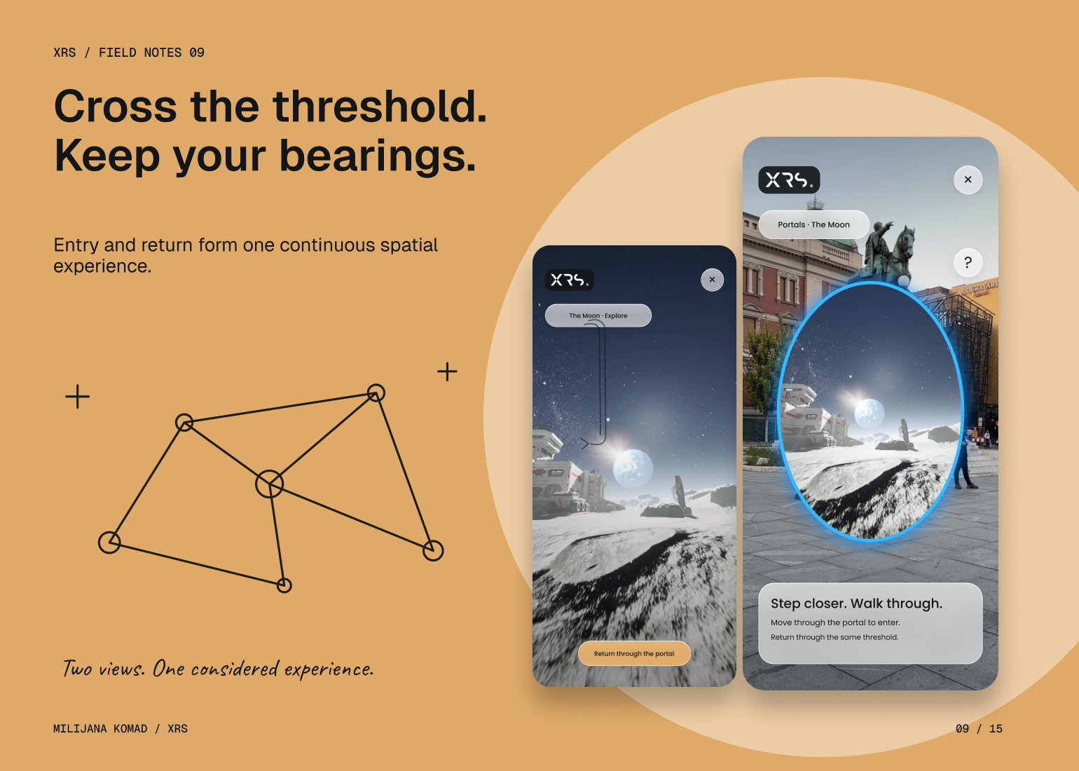
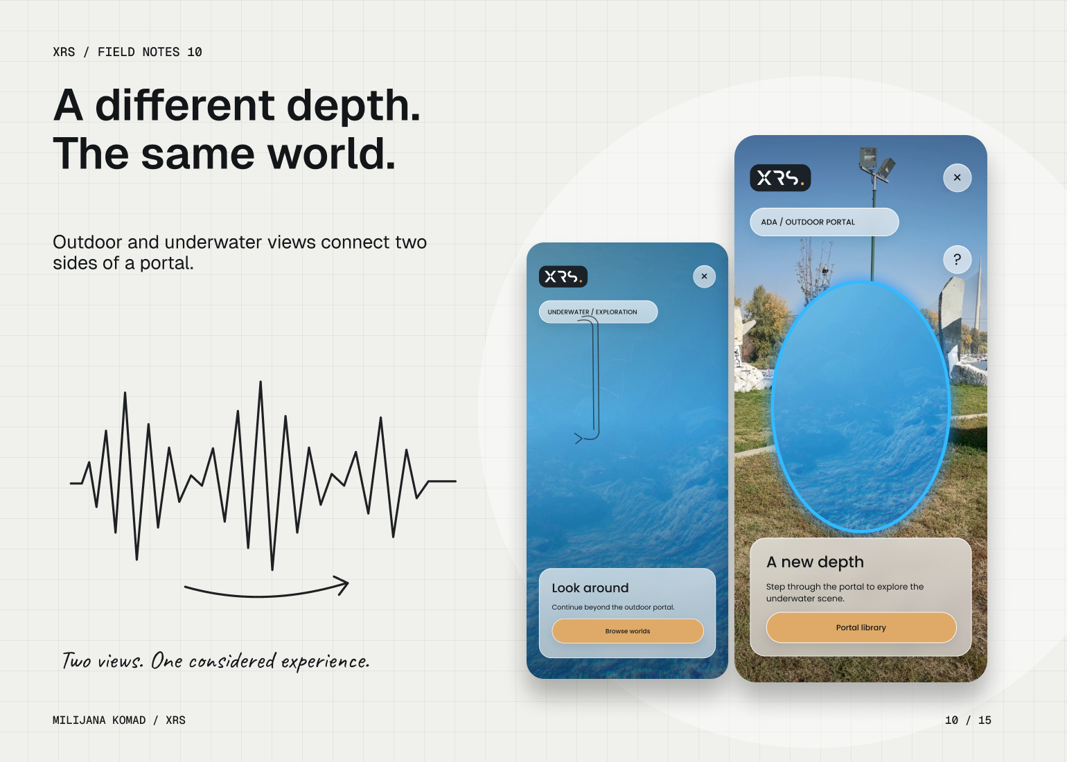
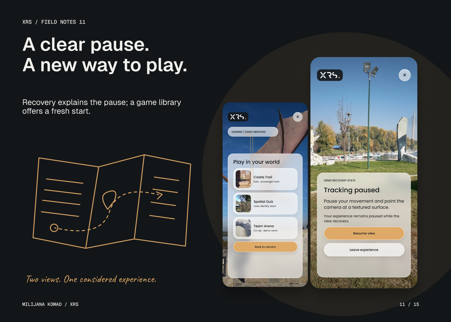
For the AI guide, I made conversation the main interaction and kept captions, microphone, language and text entry close to it. For portals, I treated entering and returning as one continuous flow: the threshold, contextual guidance and return control explain how the experience relates to the physical surroundings. I also designed a tracking-paused state that tells the user what happened and what to do next.
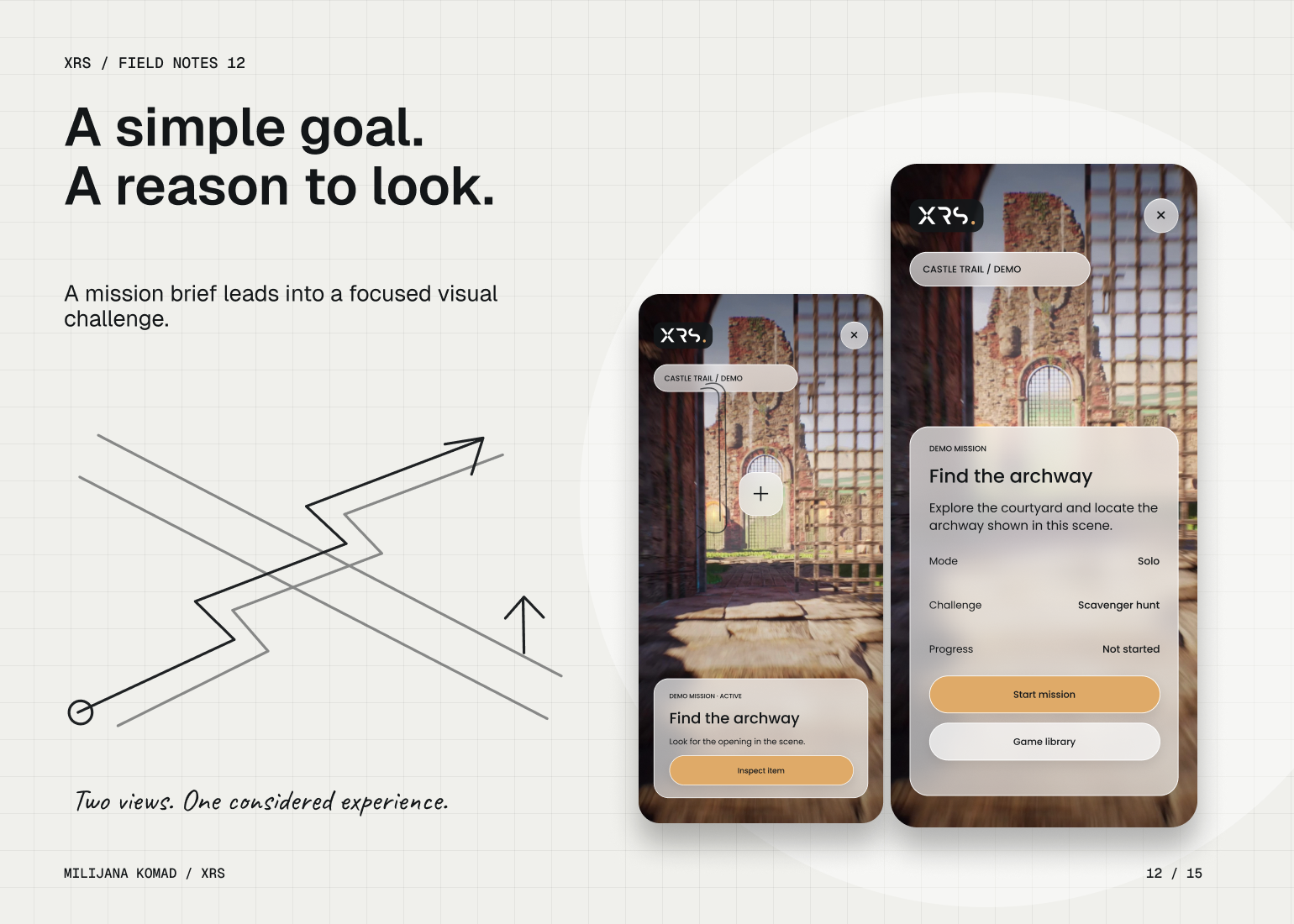
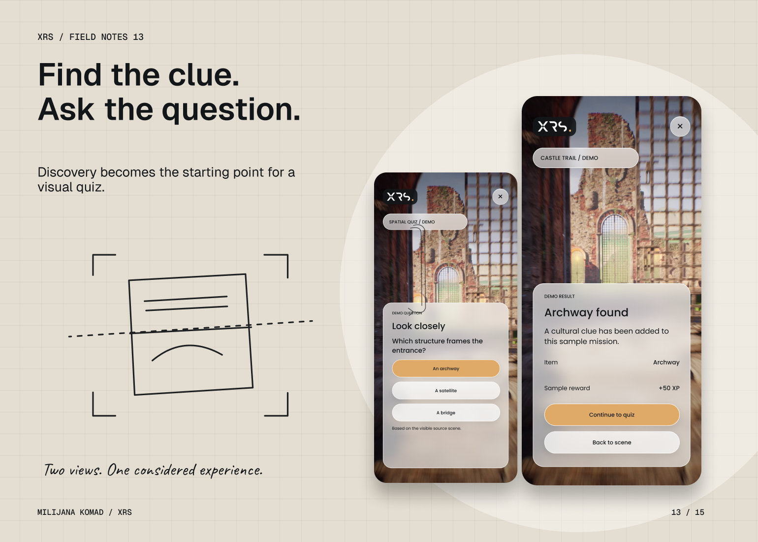
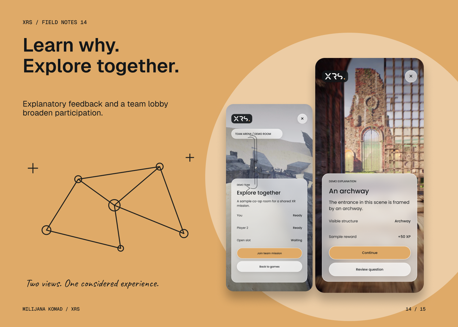
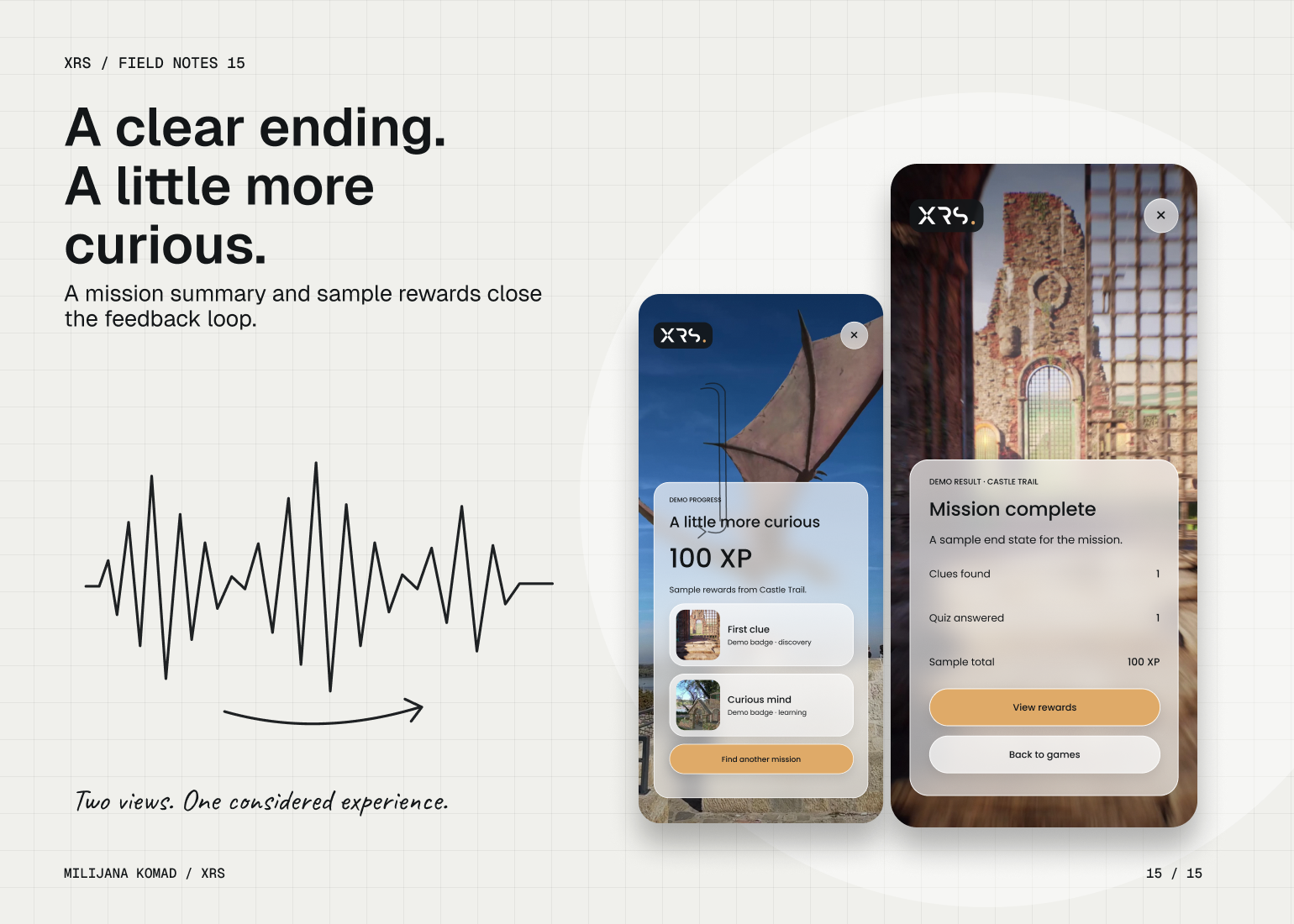
The game flows use a short brief, one visible objective, discovery feedback, a quiz explanation and a final summary. Each step makes the next action understandable while giving the cultural content room to matter. Across the 30 screens, the result is a consistent interaction model and a visual prototype that can be reviewed and developed further; illustrative maps, sample rewards and demo states remain clearly identified.