


Stilla: Vision Pro concept
Stilla
A wellbeing product can undermine its own purpose when it adds too many choices, demands or interruptions. Designing for Vision Pro introduced another question: what should occupy someone's surrounding space, and what should stay out of the way? My 0-to-1 task was to establish a spatial interaction model for choosing, entering and leaving a practice without turning a quiet moment into another interface to manage.
Back to LabVision Pro concept
Spatial UX / Vision Pro / UI
AI + Figma

Visual Identity
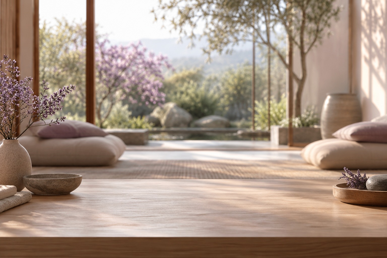
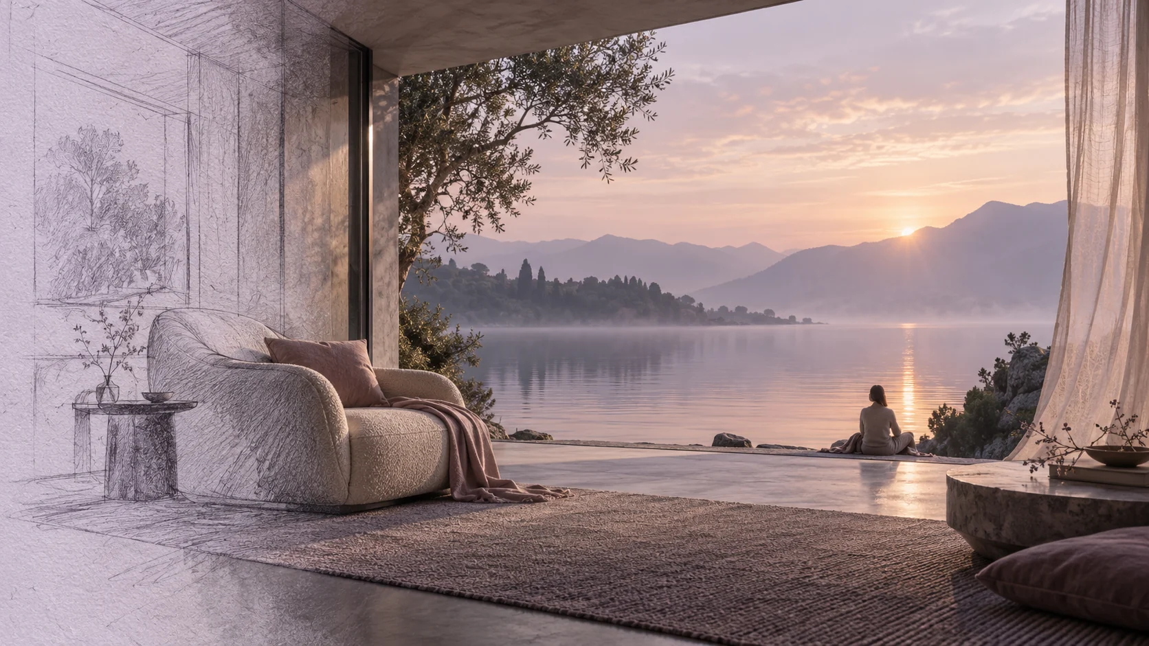
For Stilla, I passed on the obvious wellness green. Deep plum, dusty lavender and a muted blush gave me something more intimate: an atmosphere with enough depth to hold a spatial experience and enough restraint to leave the person some room. The colors sit comfortably beside an environment rather than trying to become the entire environment themselves.
Fraunces adds a human, slightly unexpected inflection to the identity. Figtree gives the interface a clear everyday voice. I kept the contrast between them deliberate, then softened the composition through spacing, rounded forms and a slower visual rhythm. There is personality here, but it does not need to keep announcing itself. That felt right for a product someone opens to take a breath.
- PLUM, LAVENDER AND MUTED BLUSH
- EXPRESSIVE TYPE WITH A QUIET COUNTERPART
- SPACE AS PART OF THE COMPOSITION
- GENTLE HIERARCHY, DELIBERATE PACING
Colors
#302B3A #C6BDD8 #D8B9AF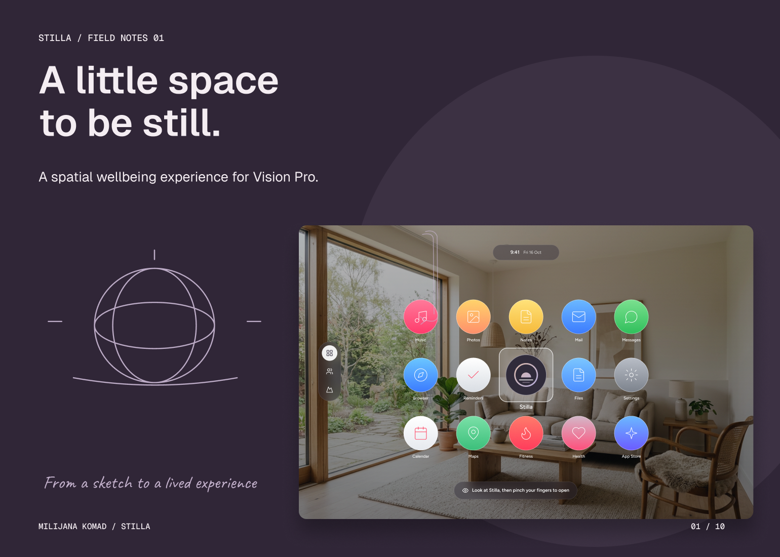
The Solution
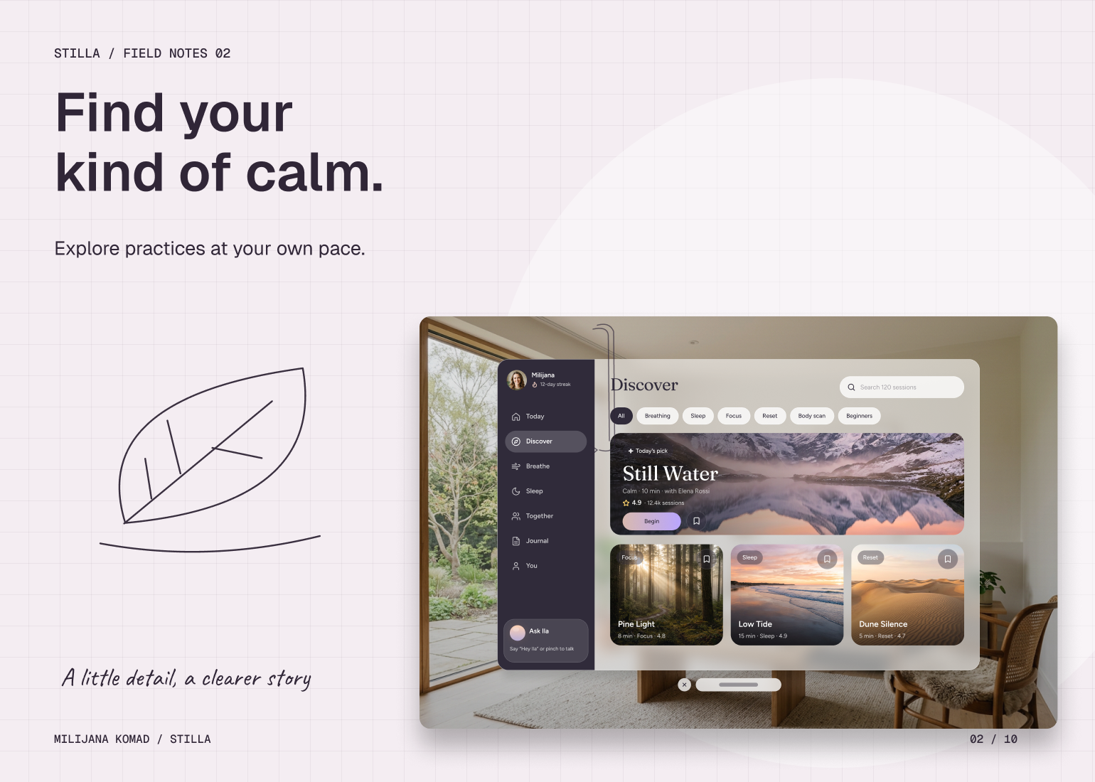
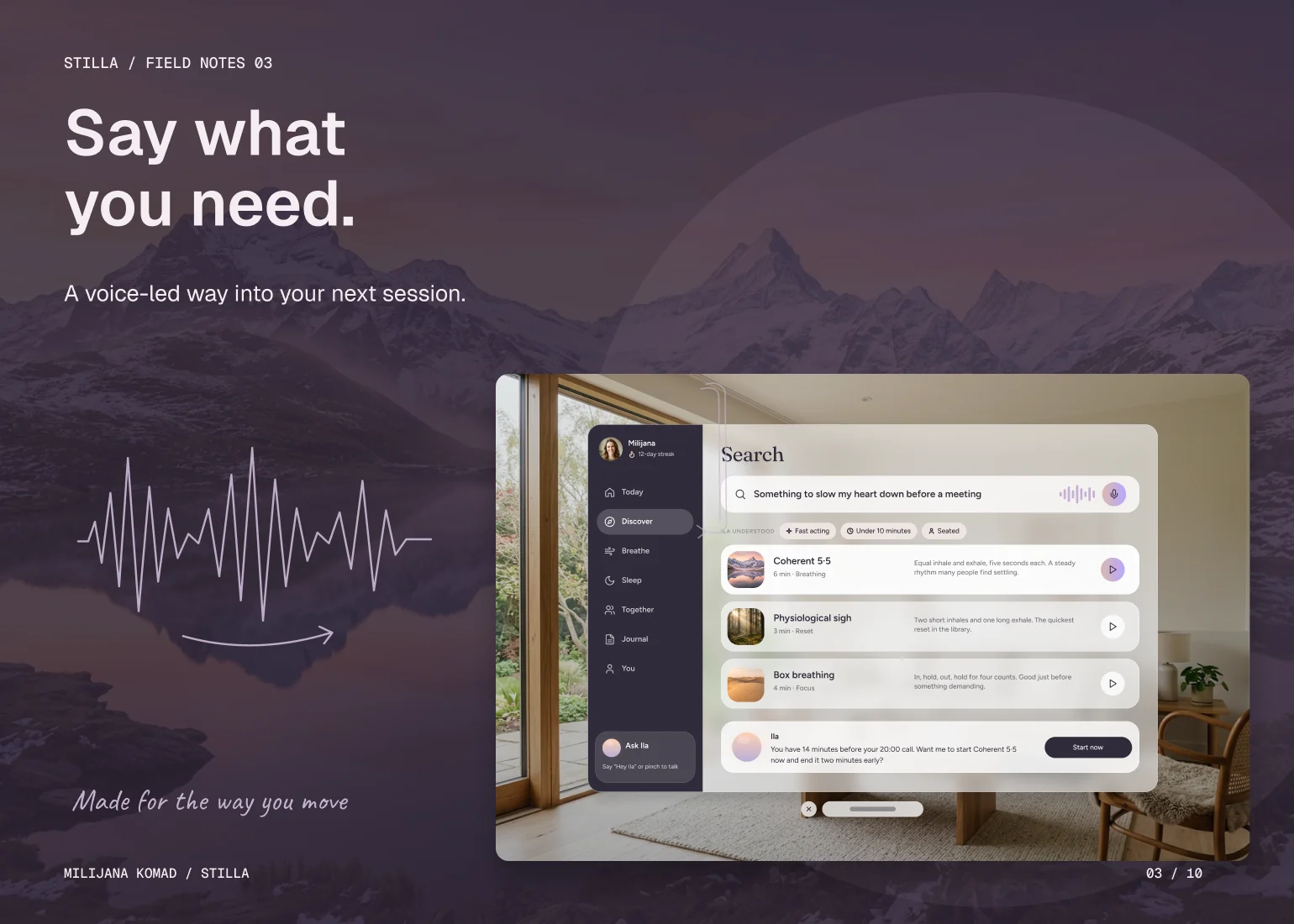
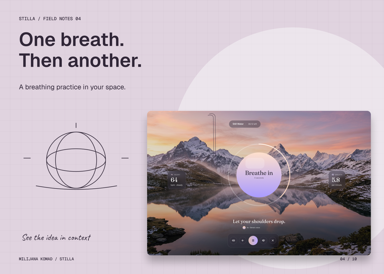
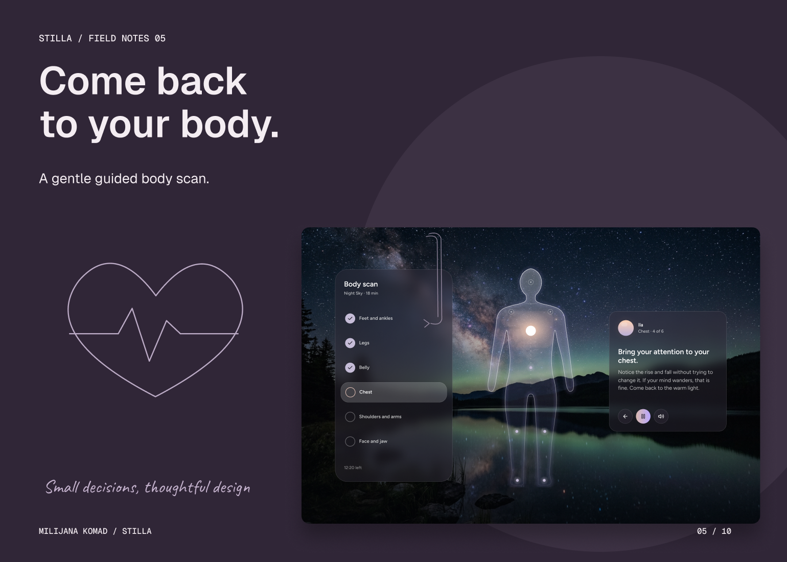
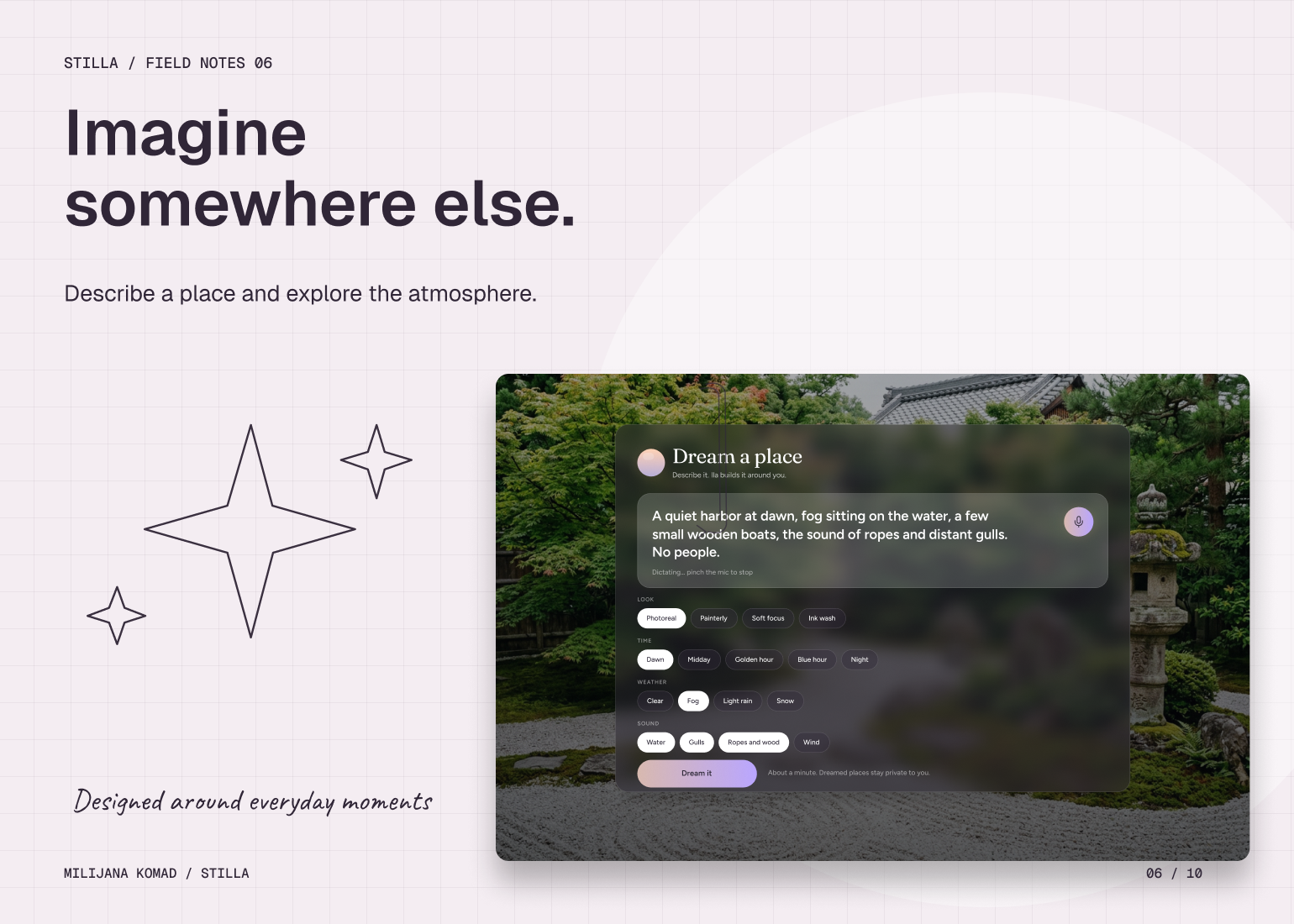
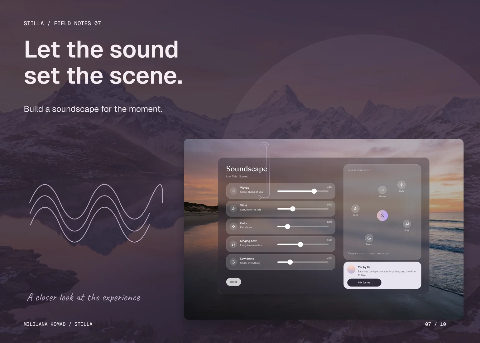
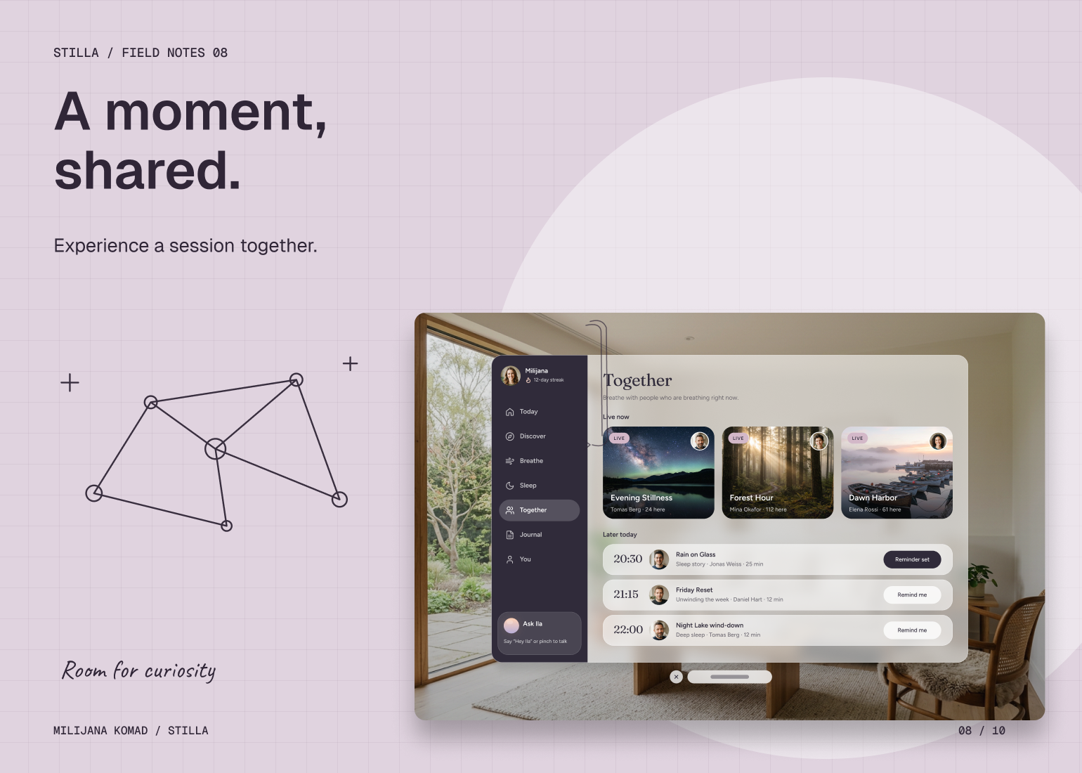
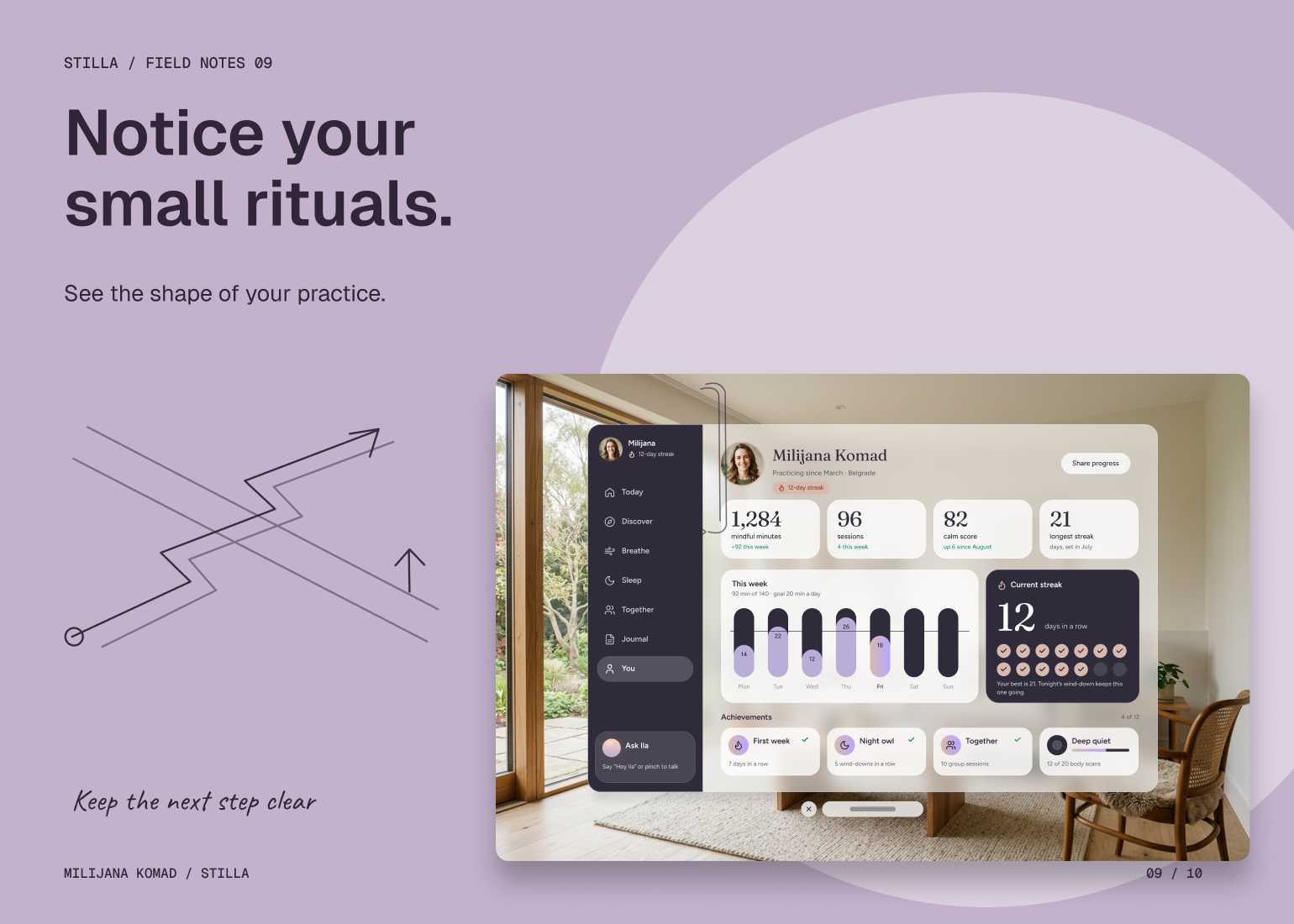
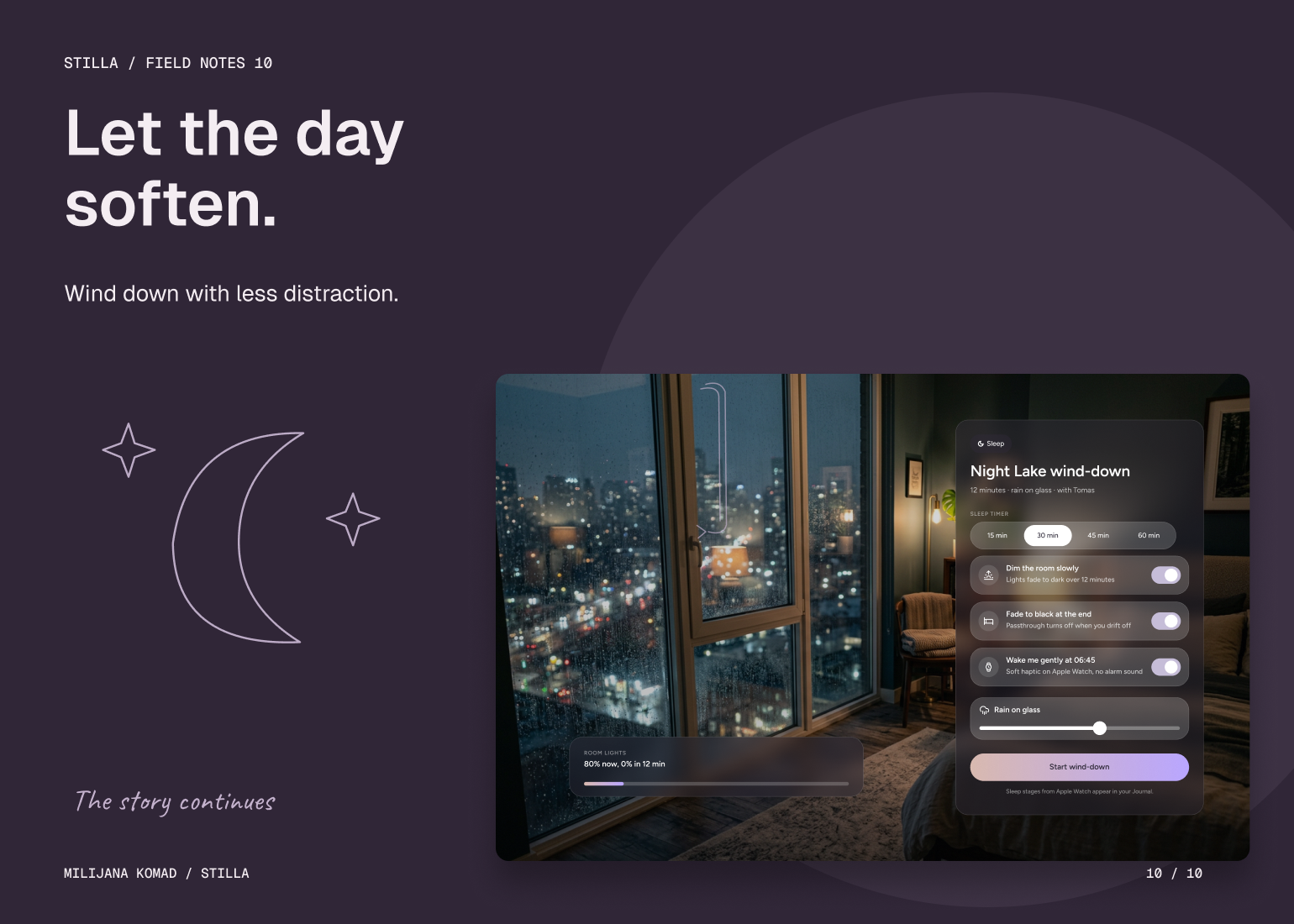
I separated choosing a practice from being inside one. Discovery views carry the options and supporting detail; session views reduce the interface to the guidance needed in that moment. I used a clear focal hierarchy, restrained controls and contextual voice entry to keep the interaction model consistent across browsing, breathing exercises and immersive environments.
The environment, sound and guidance work as layers rather than competing destinations. People can adjust the atmosphere without abandoning the session, while completion and journal views create a deliberate transition back out. Shared sessions and accessibility preferences follow the same structure. My solution is built around those transitions: the product makes the next action understandable, then leaves space for the experience itself.