


Healthy AI: Health + AI concept
Healthy AI
Personal health information is distributed across records, measurements and individual moments of capture. Bringing it into one place does not automatically make it understandable, especially when AI adds an interpretation. My 0-to-1 challenge was to define how a personal health concept could organize those sources, show their context and preserve a clear distinction between captured information and the explanations built around it.
Back to LabHealth + AI concept
Health UX / AI explainability / UI
AI + Figma


Visual Identity
With Healthy AI, I wanted to avoid the two easy extremes: clinical distance and cheerful reassurance that the information has not earned. I chose a near-black foundation with coral and teal accents, using color selectively to separate information and give the interface some warmth. The person's images, records and readings remain the material the design has to respect.
I stayed with SF Pro and let weight, scale and spacing establish the hierarchy. One typographic voice helps the overview, capture journeys and source-based explanations feel like parts of the same product. Clear framing keeps a captured image distinct from a reading or an interpretation. The identity should make space for the person behind the data, without making the data look more certain than it is.
- NEAR-BLACK WITH CORAL AND TEAL ACCENTS
- ONE TYPE FAMILY, A DELIBERATE INFORMATION HIERARCHY
- CLEAR FRAMING FOR CAPTURE, SOURCE AND INTERPRETATION
- WARMTH WITHOUT VISUAL OVERPROMISE

Colors
#1D1D1F #FF6B80 #08B4AC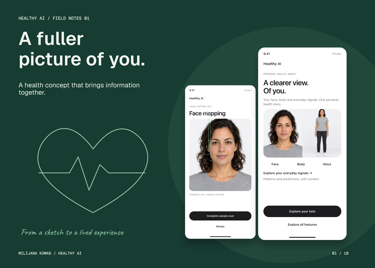
The Solution
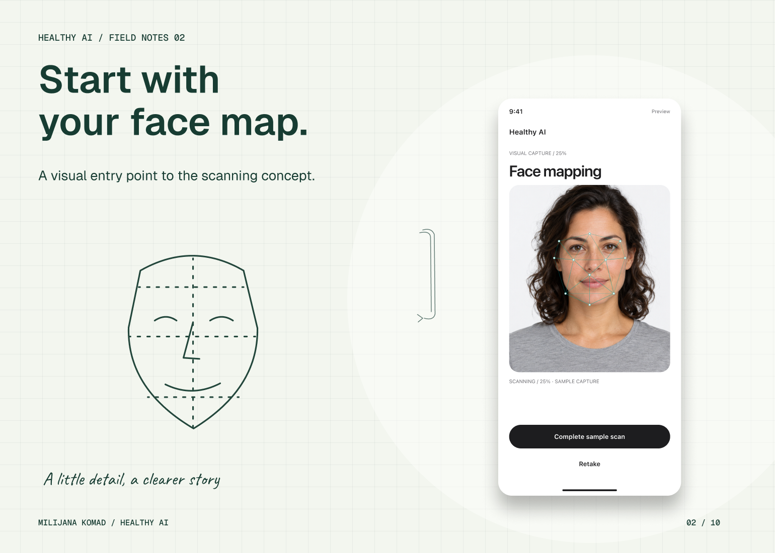
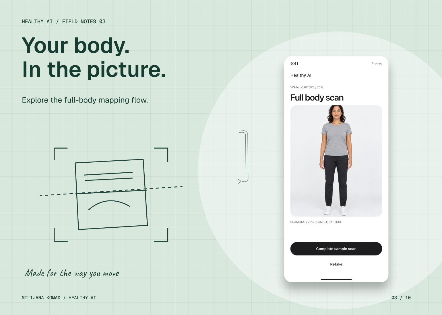
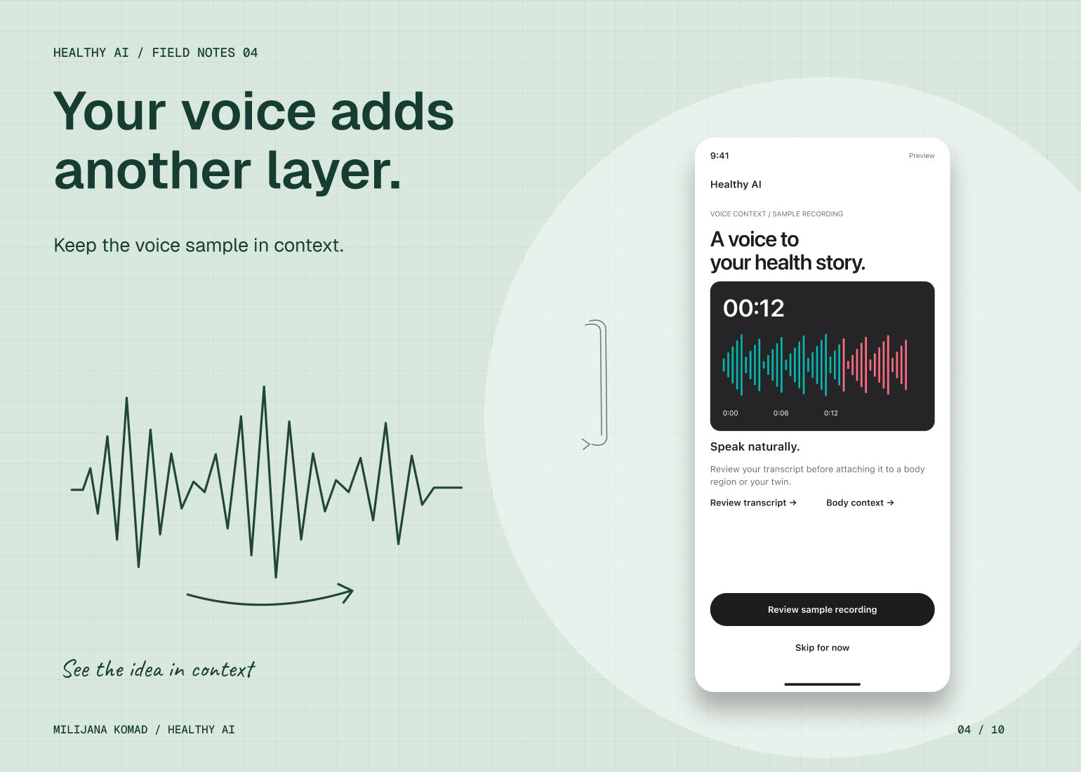
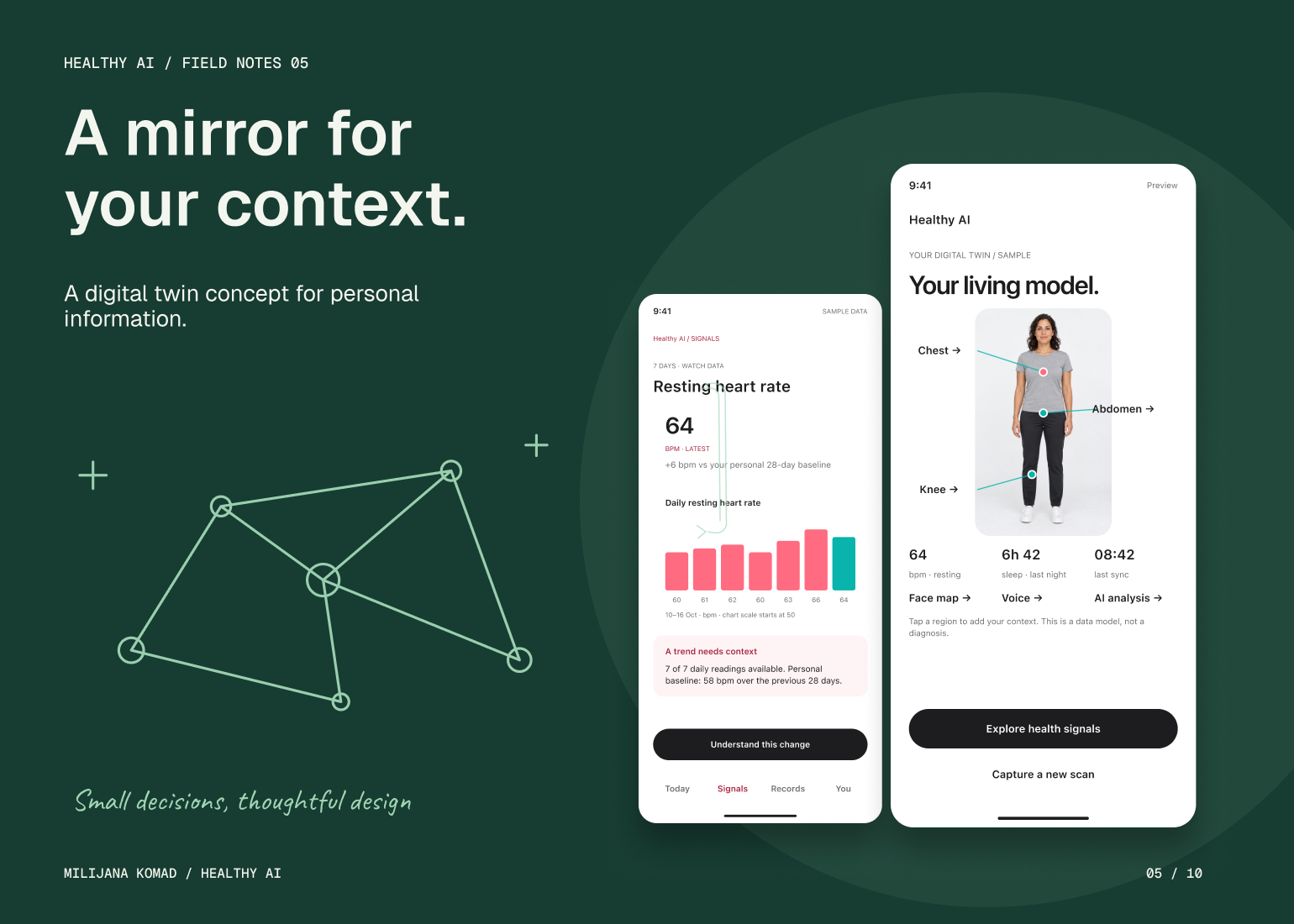
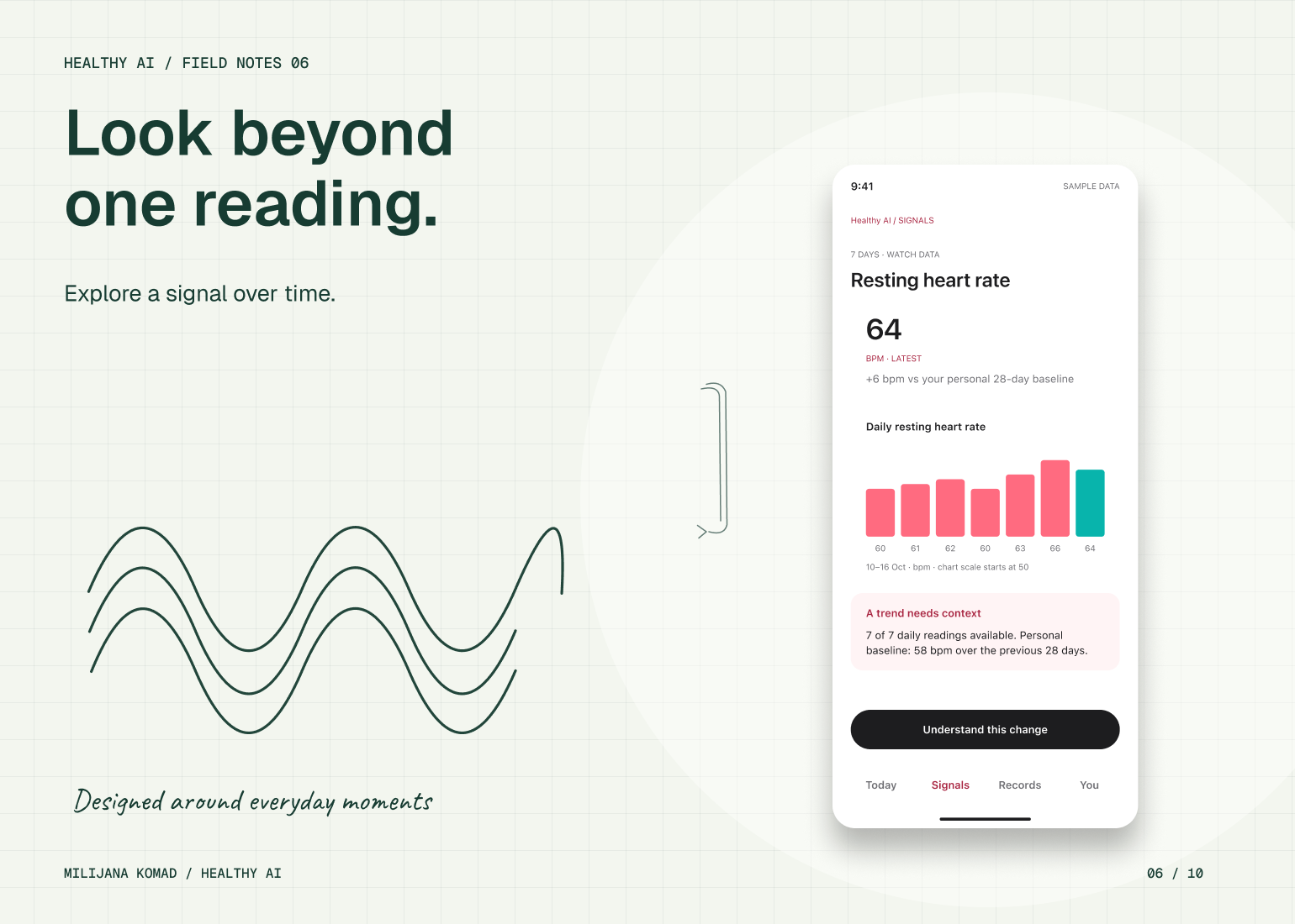
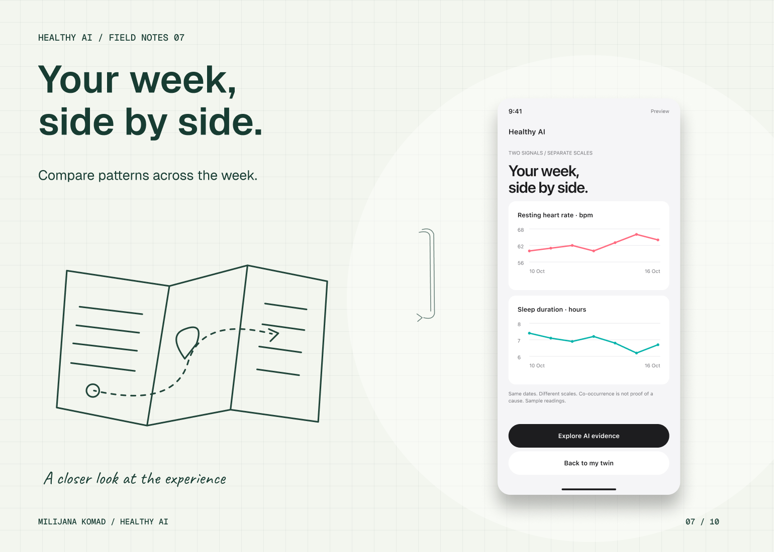
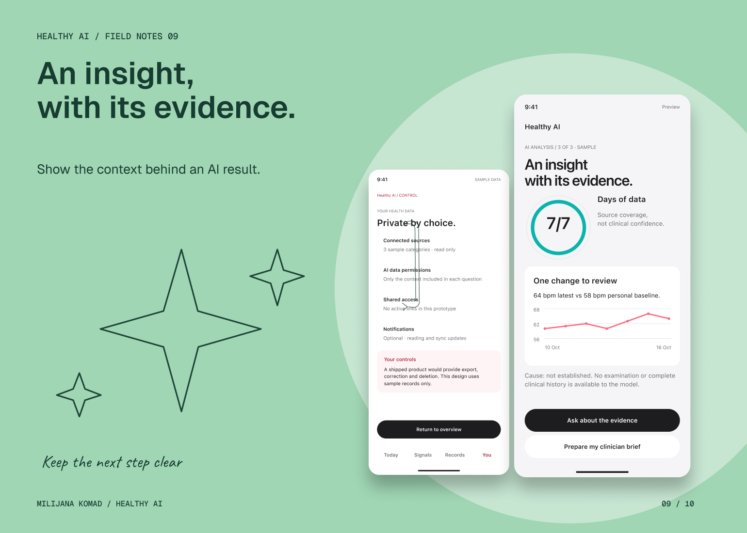
I structured the concept around a personal overview with separate entry points for records, trends, check-ins and face, body and voice capture. Each capture journey has preparation, progress and review states, while the digital twin provides a visual route into related information. Comparisons place readings in a time frame, rather than presenting each one as a complete account of the person.
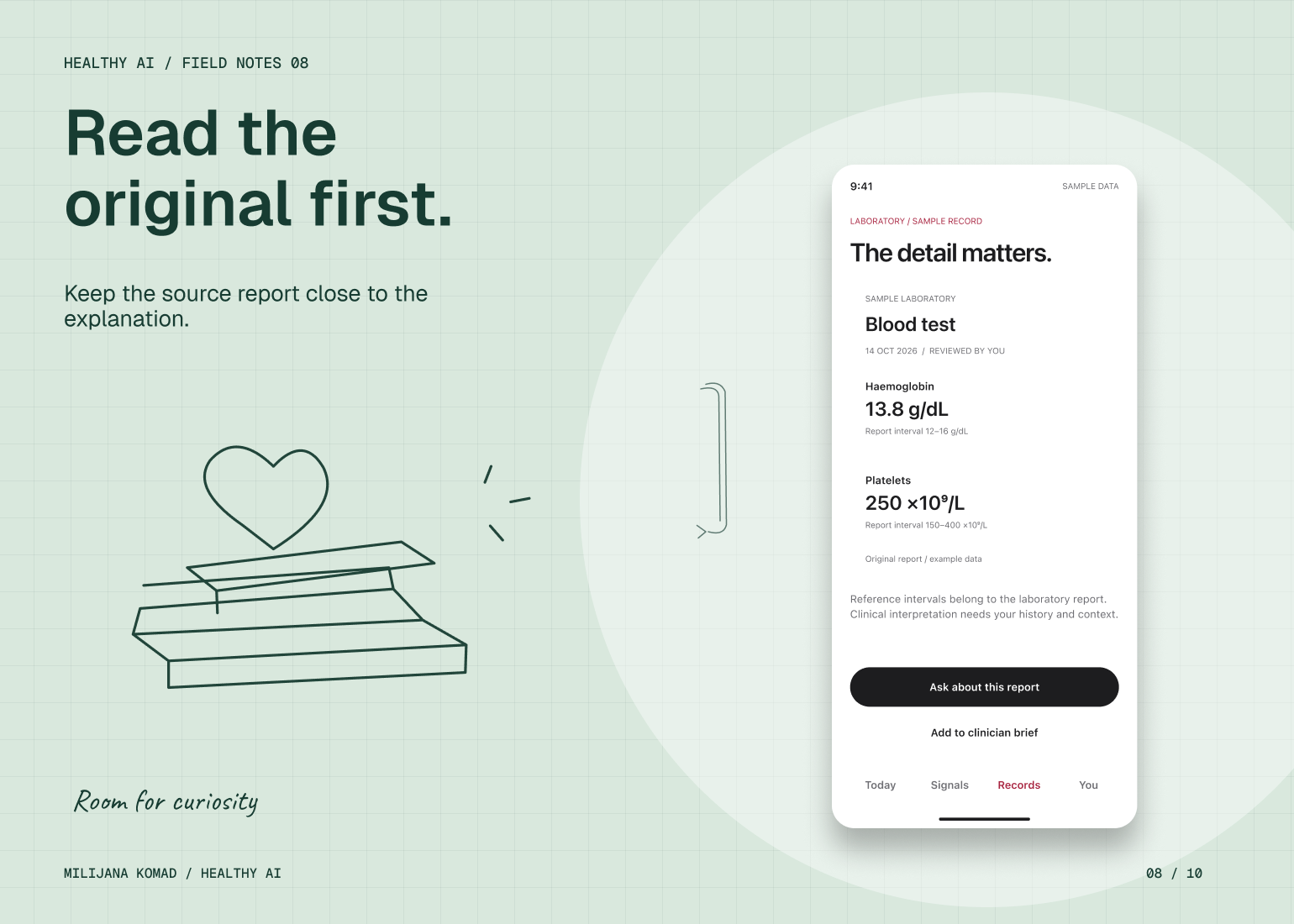
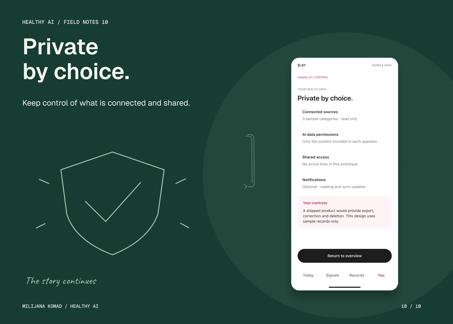
For AI-supported views, I kept the original report or source information close to the explanation and gave contextual detail its own hierarchy. Privacy, connection and sharing controls make the scope of each action explicit. My solution focuses on traceability and user agency: a person should be able to inspect what an interpretation draws on and decide what information they connect or share.