


BabyCorn: Kids' app concept
BabyCorn
BabyCorn needed to serve two audiences with different abilities and responsibilities. Children need recognizable choices and forgiving navigation; grown-ups need understandable settings and a clear boundary around adult actions. My 0-to-1 challenge was to define the content structure, interaction patterns and visual language for both, without letting the operational side of the product interrupt a child's route to a story, song or bedtime activity.
Back to LabKids' app concept
Children’s UX / Parental controls / UI
AI + Figma

Visual Identity
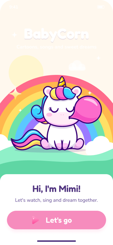
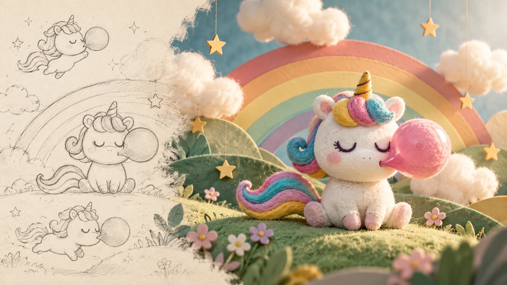
BabyCorn gave me permission to be playful, but play still needed a visual grammar. Purple provides the world with a familiar anchor, pink brings the cheerful moments forward, and warm cream gives the illustrations room to shine. I wanted the colors to feel like they belonged to Mimi's world, rather than a collection of bright buttons competing for a child's attention.
Fredoka gives the larger words a friendly, rounded character. Nunito keeps labels and grown-up information easy to approach. I carried the same soft geometry through cards, controls and illustration frames, then shifted the atmosphere for bedtime. The charm is in that continuity: the world can become quieter without suddenly feeling like a different place. A little magic, with someone sensible looking after the details.
- PURPLE, PINK AND WARM CREAM
- ROUNDED LETTERFORMS, FAMILIAR SHAPES
- ILLUSTRATION WITH A CONSISTENT VISUAL GRAMMAR
- A SOFTER EXPRESSION FOR BEDTIME
Colors
#50347F #F68CBD #FFF8EE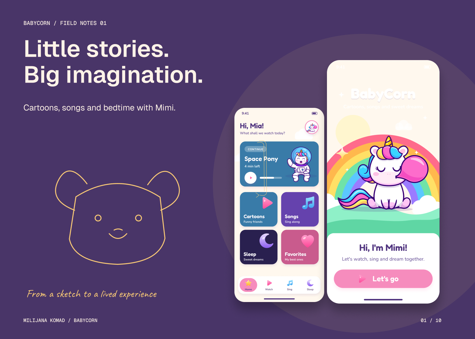
The Solution
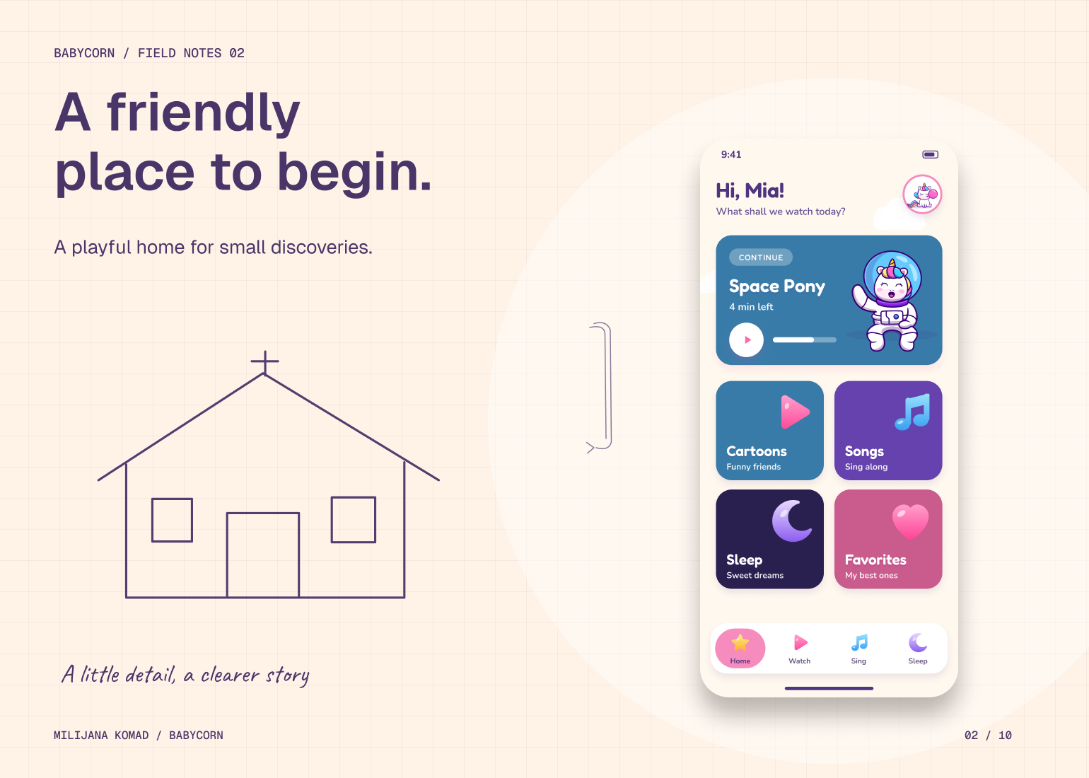
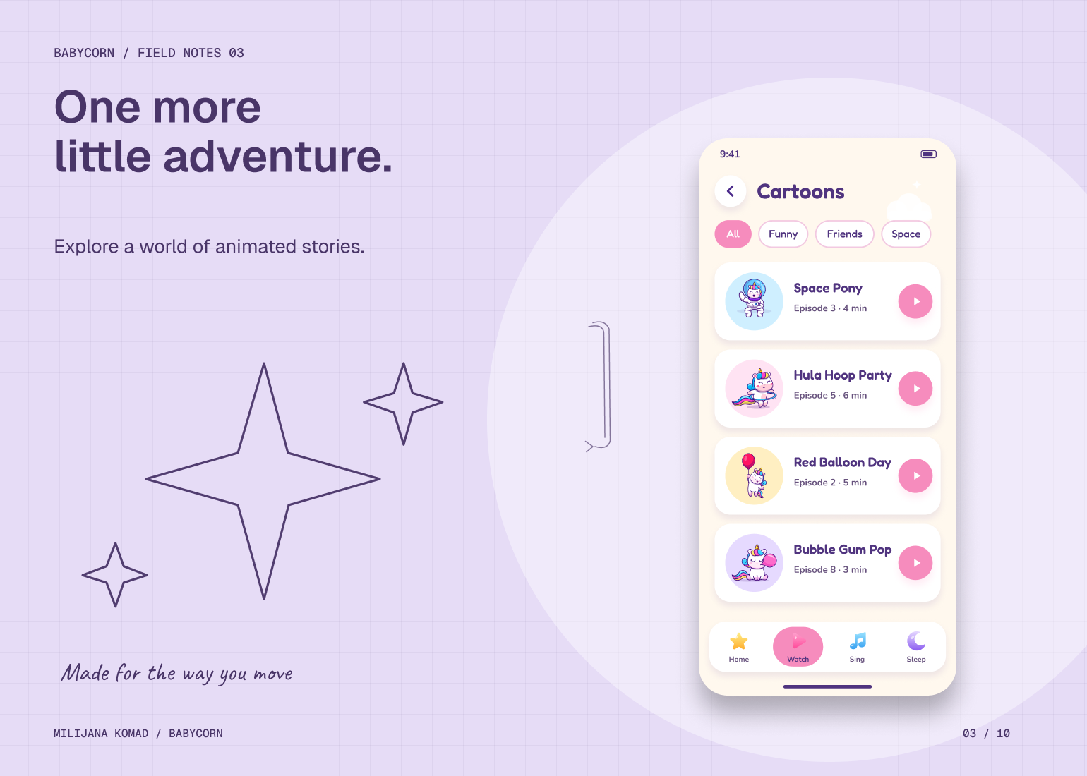
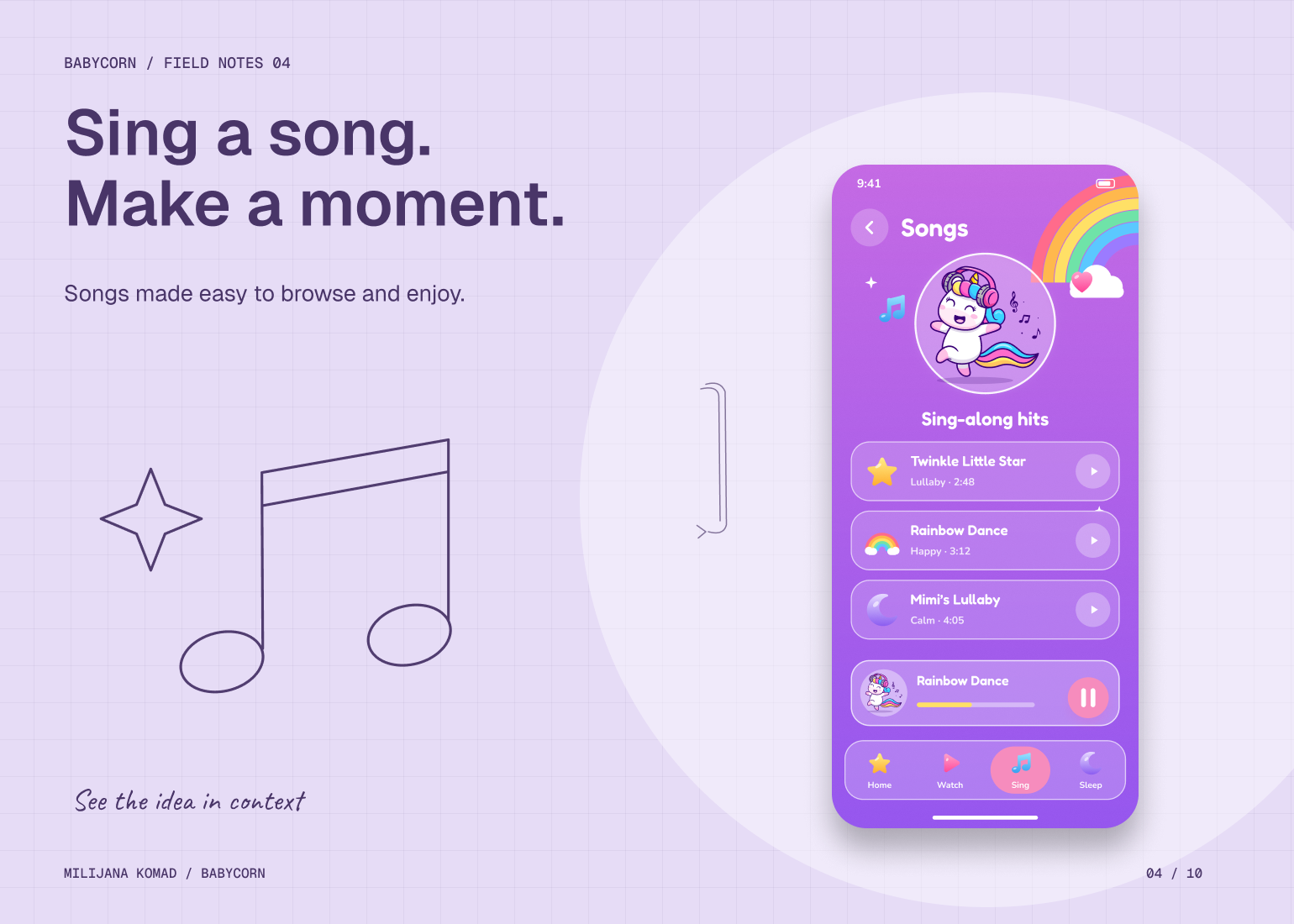
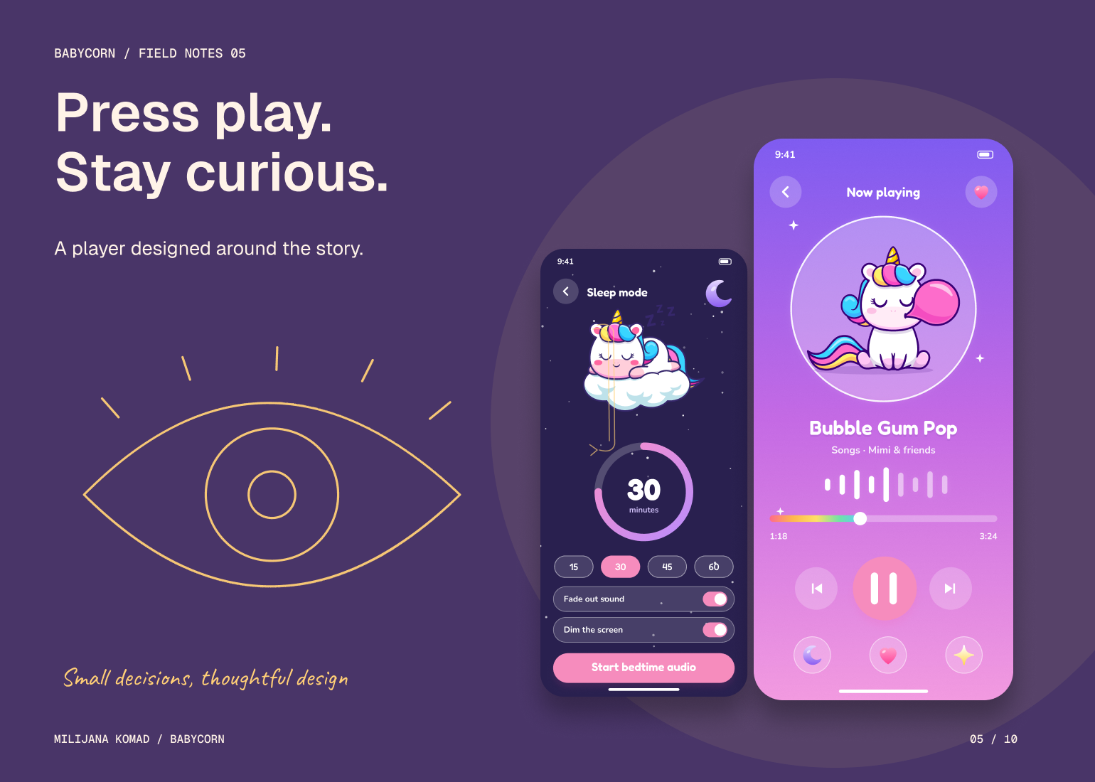
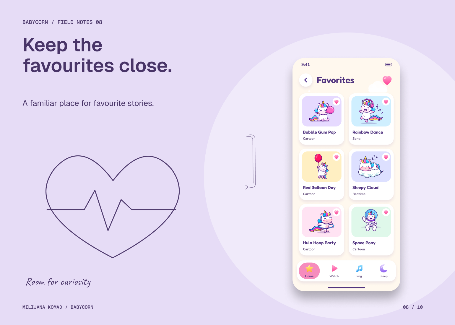
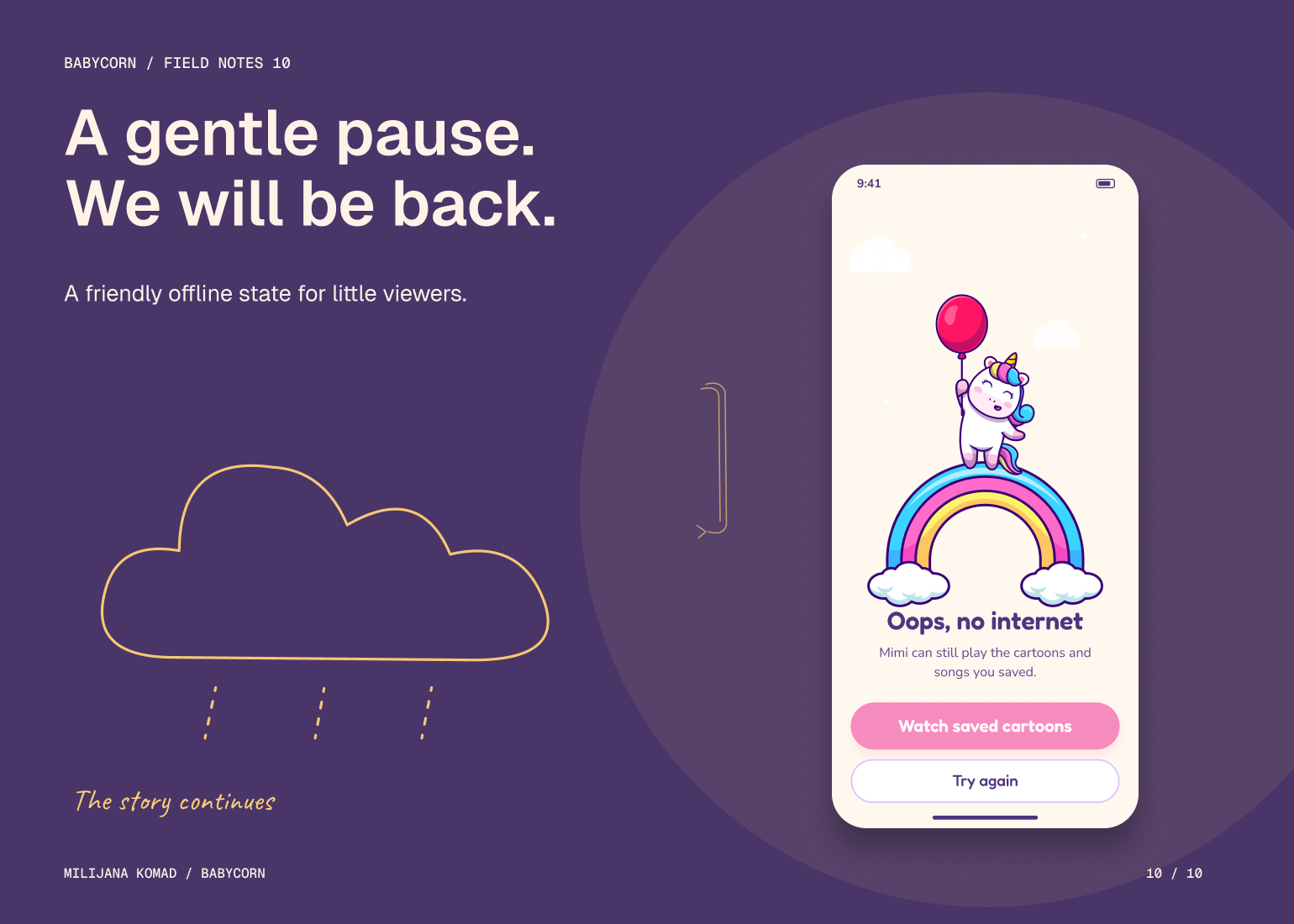
I built the children's information architecture around recognizable activities: cartoons, songs, favorites and sleep. Repeated navigation patterns and illustrated cues make each destination familiar, while the player keeps the primary actions close to the content. The character and visual language provide continuity across browsing, playback and interruptions, including empty and offline states.
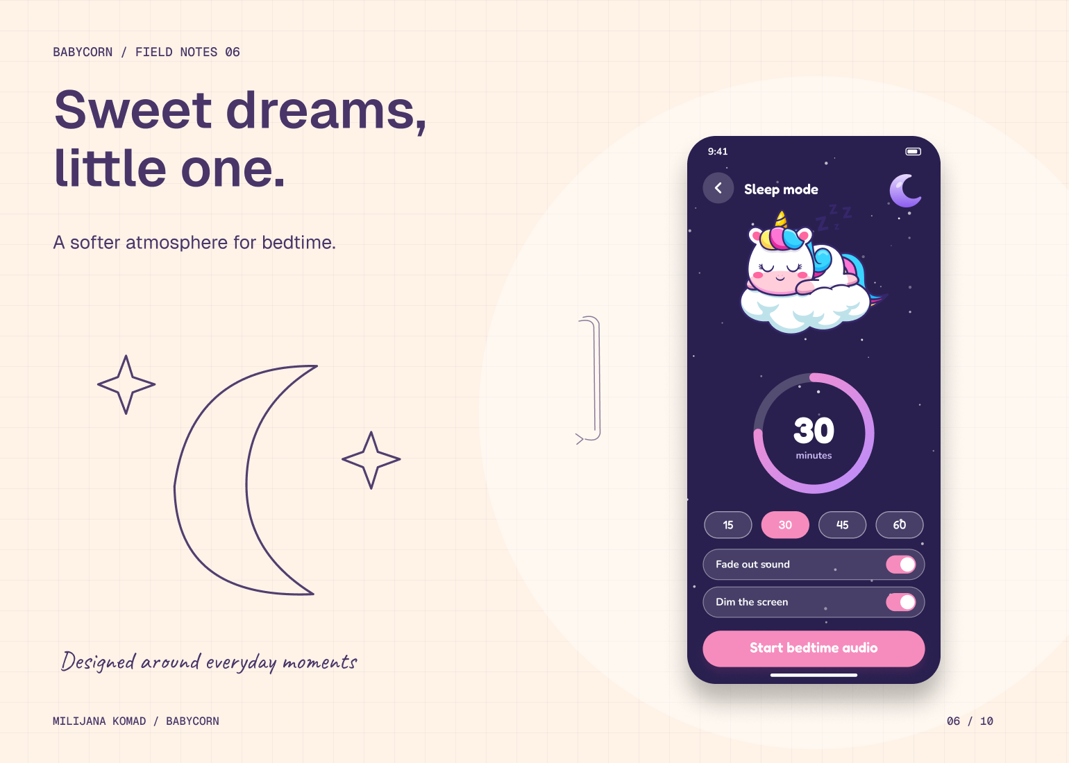
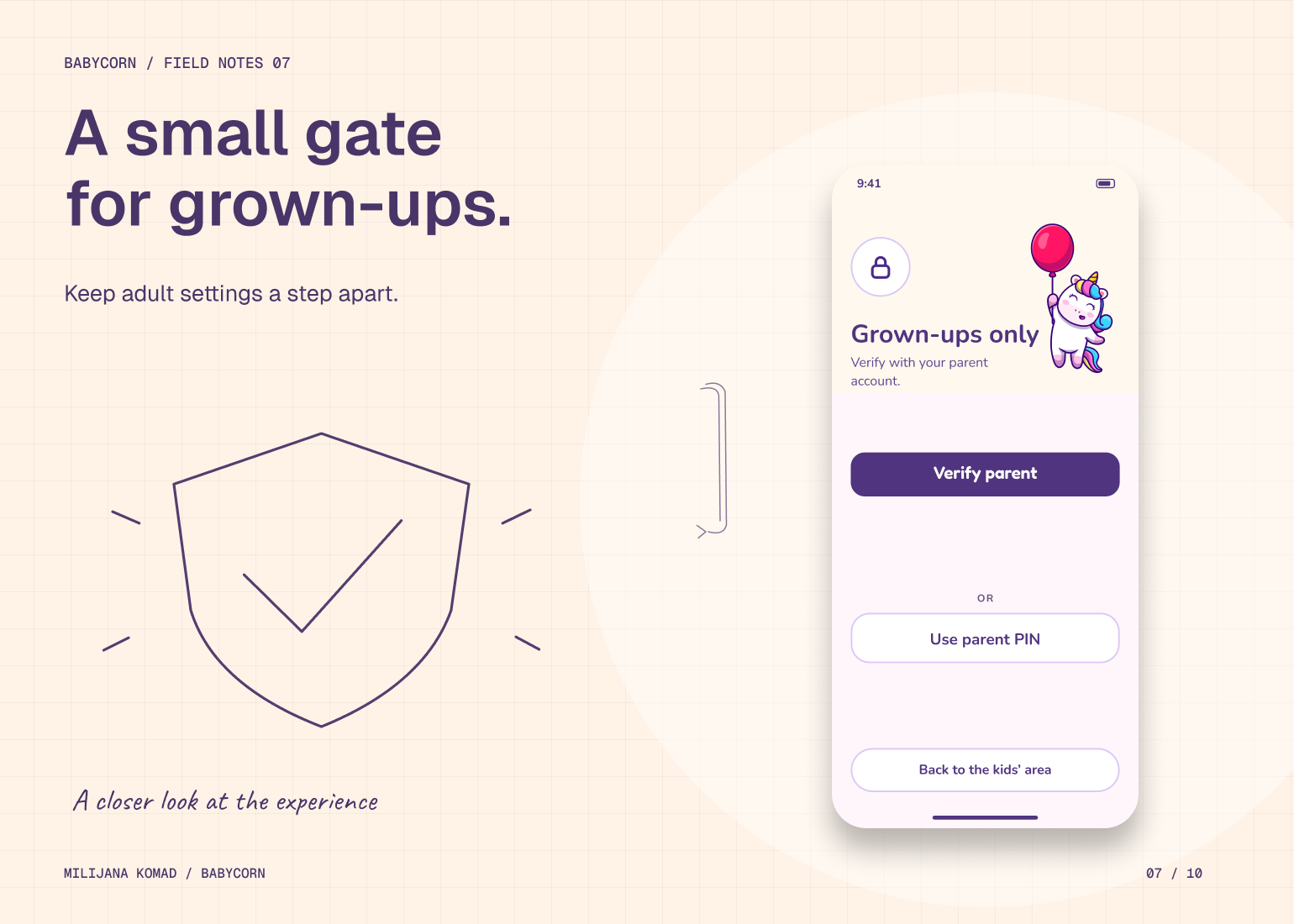
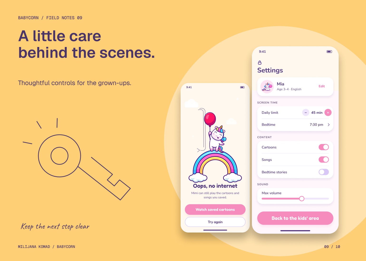
I placed adult settings behind a parent gate and kept those controls separate from the child's content choices. Sleep mode has a distinct atmosphere and a focused set of timing and playback decisions, rather than behaving like another catalog. The solution balances the two audiences through structure: children get a direct route to what they recognize, and grown-ups have a dedicated place to manage the experience.