


Hornet
Premium unbundling
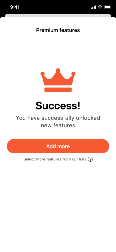
After this study you will know that
I can turn a revenue target into a system people understand, and I can do it as the only designer in the room.
I designed a separate in-app store where Hornet members spend Honey, the app’s existing currency, on individual Premium features, from a sketch on paper to production. Honey purchases went up by 37%+, and the feature has been live for about three years.
Hornet: Premium Unbundling & Revenue Optimization
The Challenge
Unbundling premium features and introducing a secondary storefront into a 15-year-old legacy social application without causing decision fatigue or alienating the existing user base.
My Role
Sole product designer. I spearheaded the behavioral architecture for the new premium flow, focusing on choice architecture, cognitive load reduction, and iterative prototyping to ensure a frictionless journey.
The Business Impact
Successfully integrated the new storefront, optimizing the conversion funnel and mitigating cognitive load. The unbundled architecture unlocked a new scalable revenue stream, and Honey purchases went up by 37%+ after launch.
increase in Honey purchases after the feature shop launched.
Hornet in numbers
- 100M+
- registered users
- 2.3M+
- monthly active users
- 100+ min
- average time in the app per week
- 21M
- messages sent per day
- 2011
- year Hornet was founded
Company-wide figures as Hornet states them for advertisers: hornetapp.com/about/advertise (checked 21 October 2026). Founding year from the Hornet Media Kit (December 2022). They describe the company, not the result of this project, and are marketing claims, not audited figures.
Finance wanted money, and fast.
Hornet is a gay dating app, and many of its features were free to use. The analytics team could tell exactly which ones people used the most. Finance and marketing wanted a part of the product that earns well, and earns fast.
The idea came from the growth and revenue lead. I joined it on paper, at the company meetup in Cape Town, with developers and the finance team around one table.
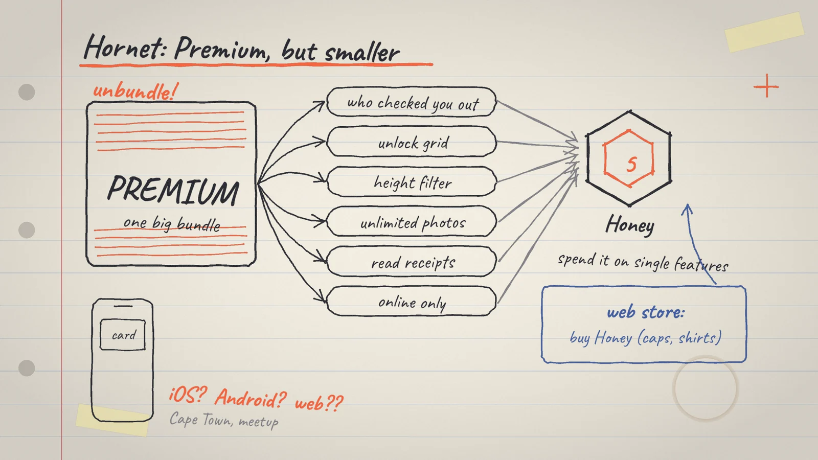
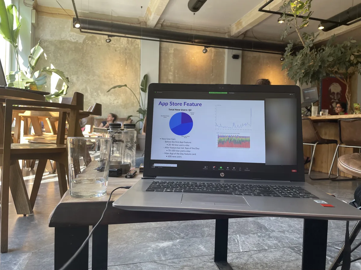
One big Premium. Many small needs.
Honey is Hornet’s in-app currency, and it already existed. You could buy it in the web store (next to caps and T-shirts), or earn it when somebody sent it for your creative content. Members spent it on stickers and on gifts to creators.
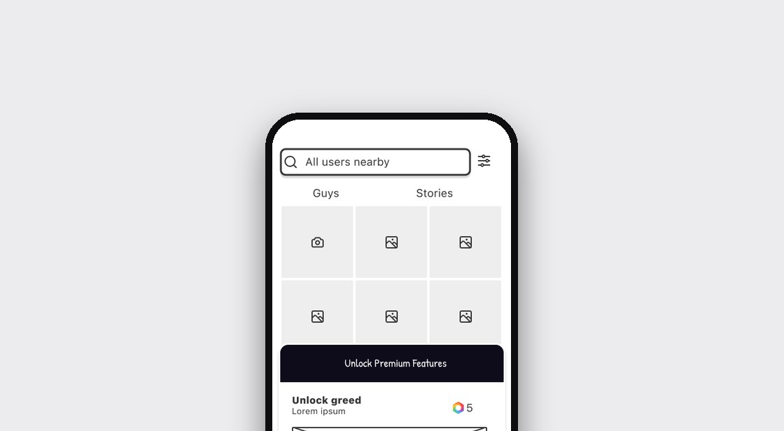
Premium, meanwhile, was one big bundle. The job was to unbundle it, so Honey could also buy single features, such as seeing who viewed your profile.
Business goal
Make money from the product quickly, without rebuilding it.
Assumed member benefit
Get the one feature I want without paying for a whole subscription.
One designer, many people.
I was the only product designer on this. I defined the flow and interaction logic, ran the research, drew the wireframes, prototypes and hi-fi screens, and designed the in-app ads and notifications for the features, and later for new ones.
I led by influence, not by authority. Nobody reported to me, and I did not manage people on this project.
I did
- Logic and behavior of the whole flow
- Research and competitor review
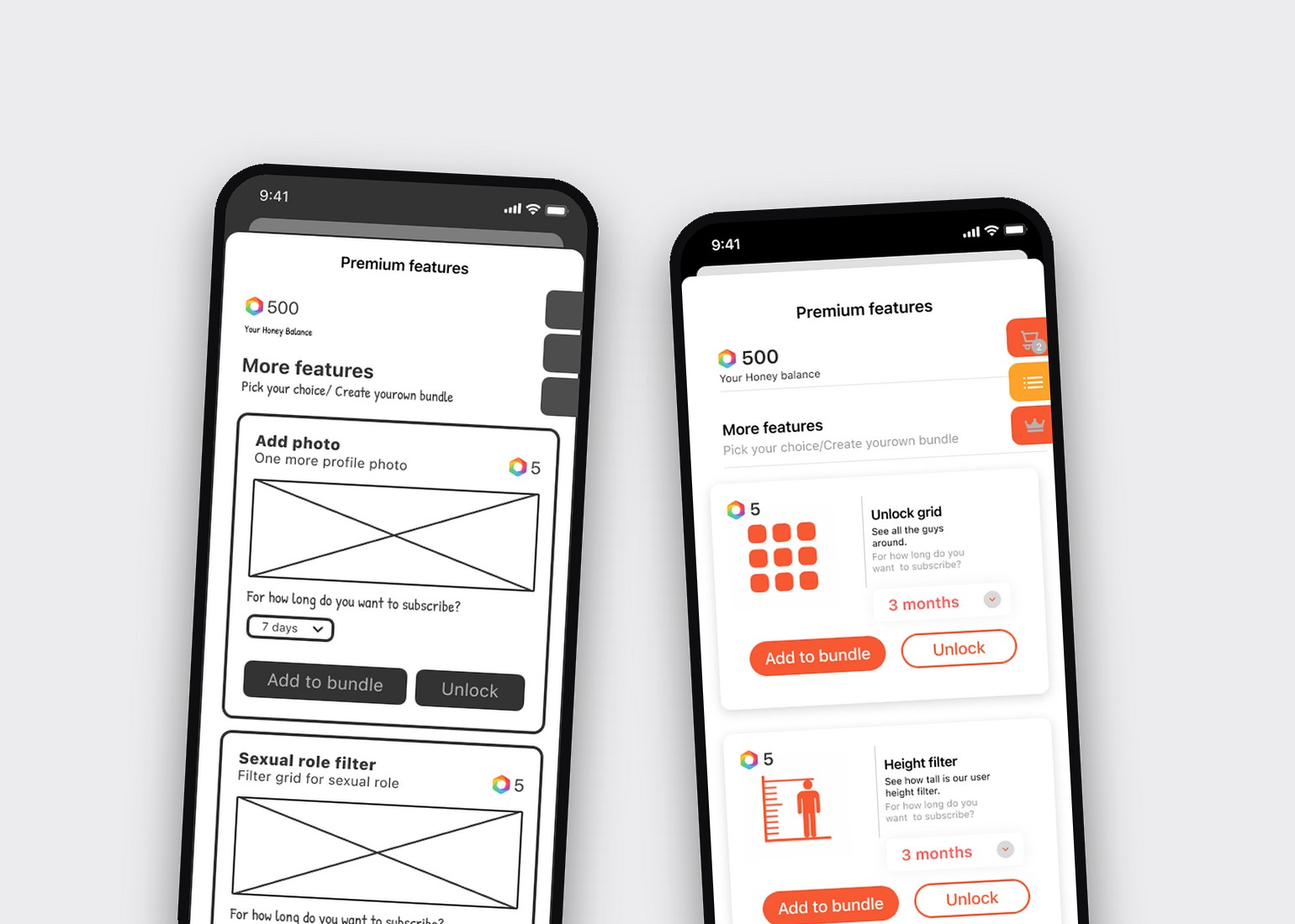
- Wireframes, prototypes, hi-fi
- Conversations with analytics, per feature and country
- Ads and notifications
Others did
- Product manager: made time for it next to regular work
- Growth and revenue lead: the idea and revenue goals
- Analytics: usage data
- 10+ QA testers: testing
- Lead developer and web team: building, and telling me what was possible
Three rules I held to.
These came from how I work, and I used them on every screen.
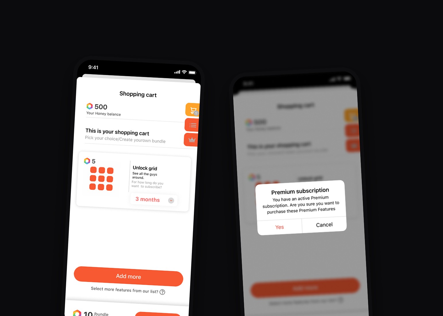
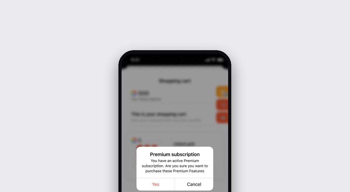
- Draw every state before building any of them. Every window variation, every case that can happen, so everyone knows what to expect.
- Test first, and let reactions set the logic. How fast people get there, what triggers them, what they like and what they don’t.
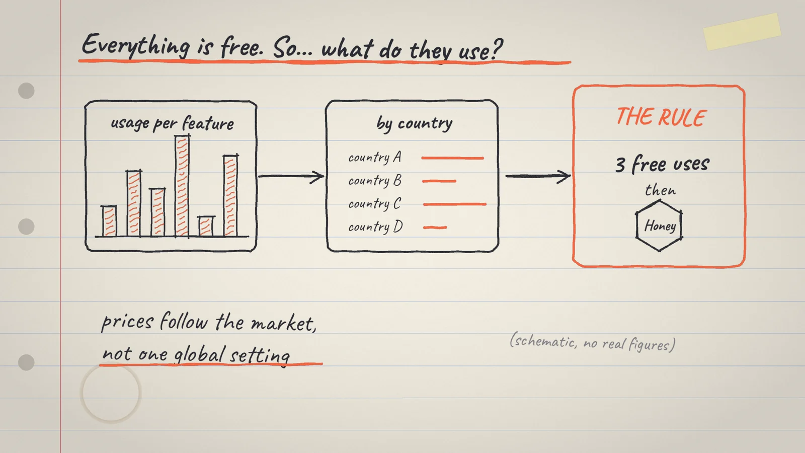
- Let data inform the price, country by country. What is popular in one country is not popular in another. The numbers came from analytics.
Same screen, two stages
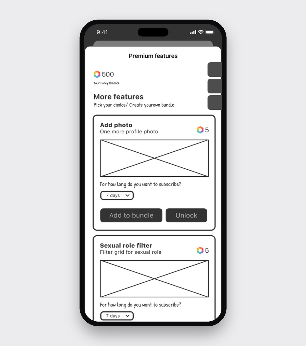
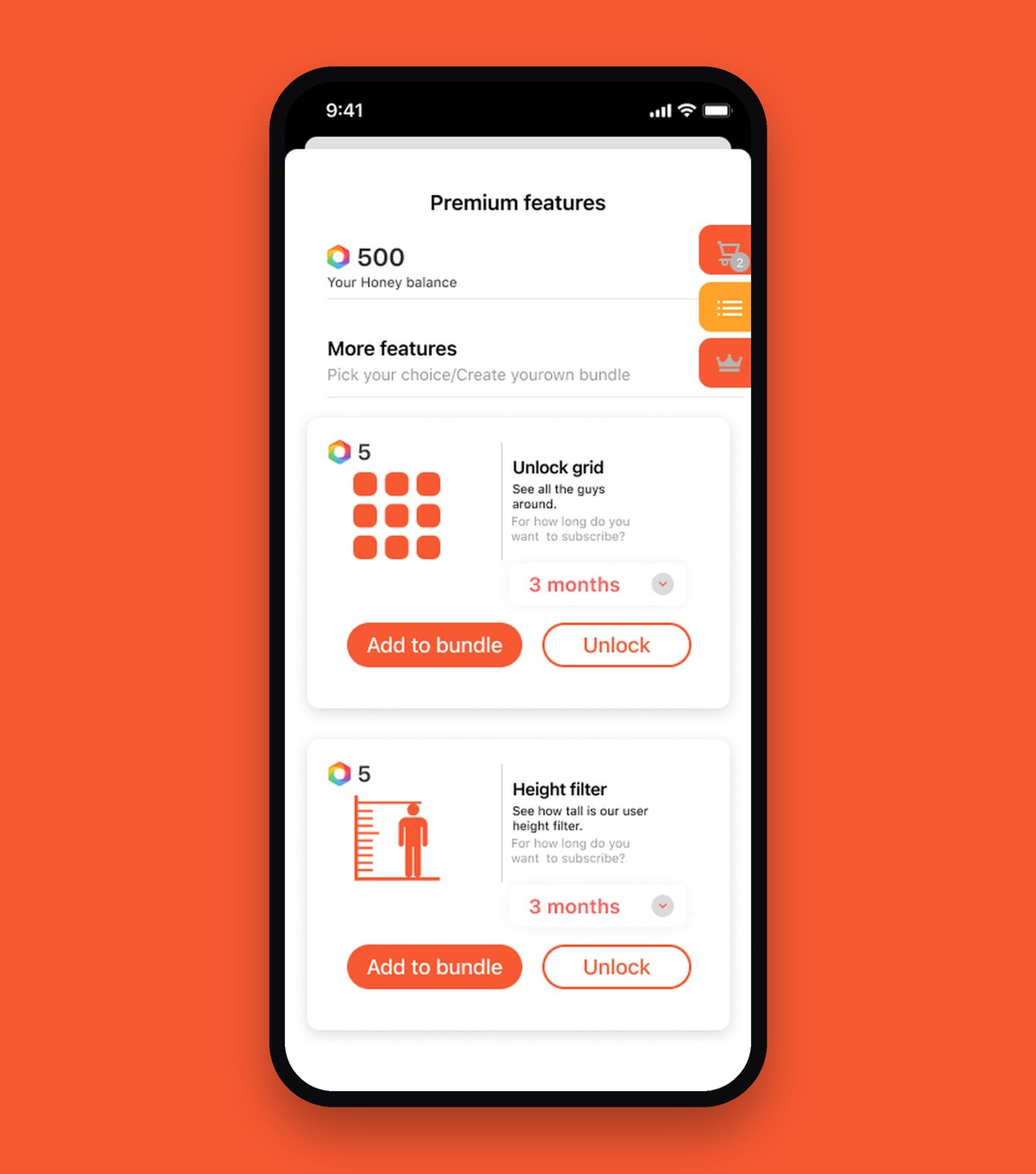
What the numbers said.
Because people could use the features freely, the analytics team could show which ones they already used the most. That is where pricing started.
Popularity differed by country, so a feature that earns well in one place would not in another. That moved me from one global price to rules per market.
In tests, I watched what people did, how fast, and what made them stop. In that data I found six types of users on Hornet, by how they behave and communicate.
Five or six meetings, one flow.
Over five or six meetings with the developers I tried different flows: how a member gets from a locked feature to the shop, what a tap does, and when it asks for payment. Then I tested the wireframes as a prototype to see how fast people got there.
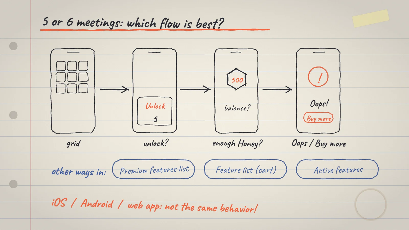
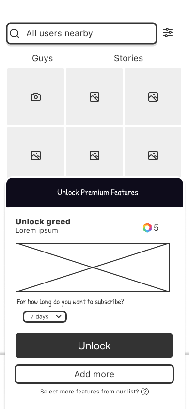
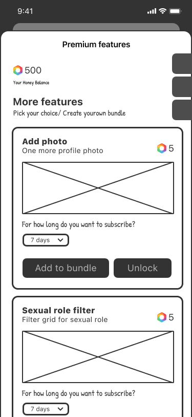
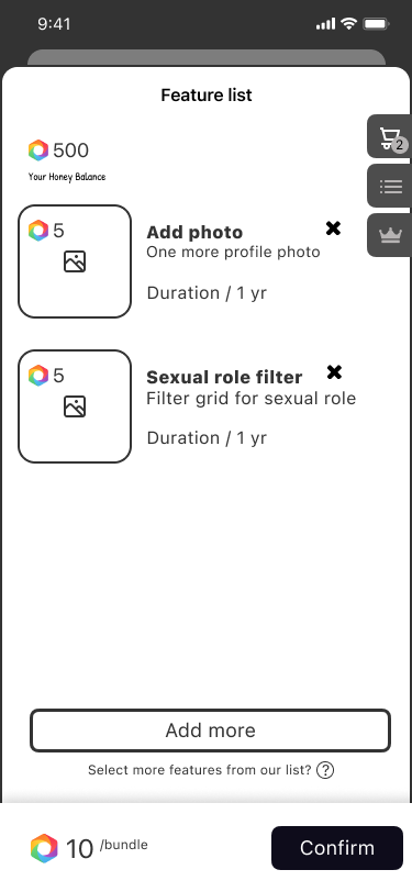
Three free uses, then Honey.
The first uses are free
- Problem
- Many features were free, so there was little reason to pay for them.
- Decision
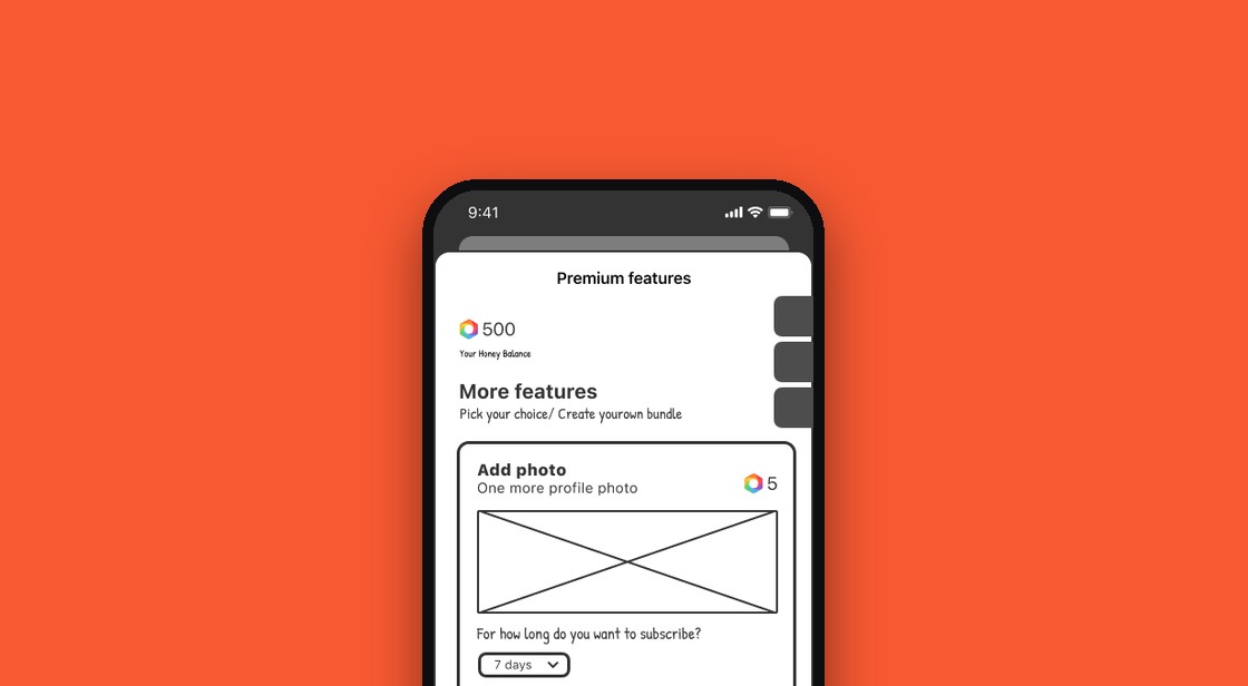
- A feature is free for the first three uses; after that it costs Honey, and some features cost more than others.
- Why
- Usage data showed which features people already reach for, and it differs by country.
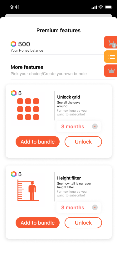
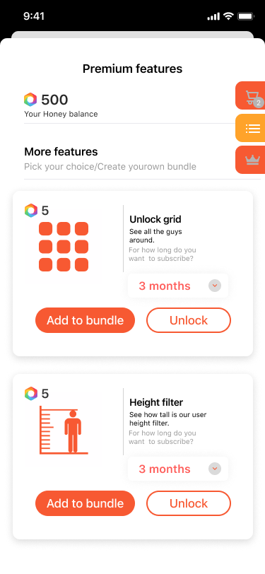
Add to bundle, or unlock now
- Problem
- A member may want one feature, or several.
- Decision
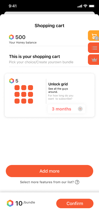
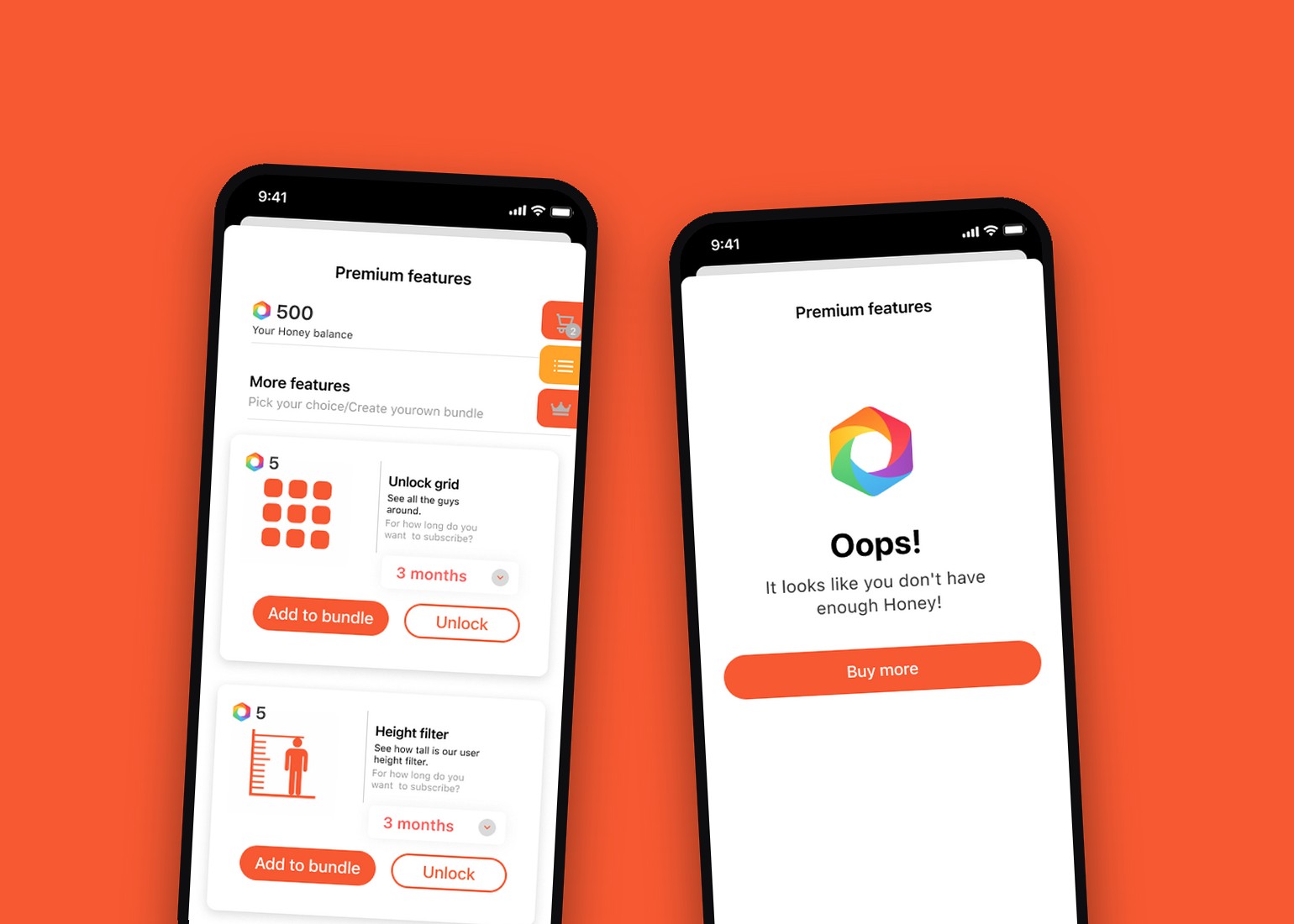
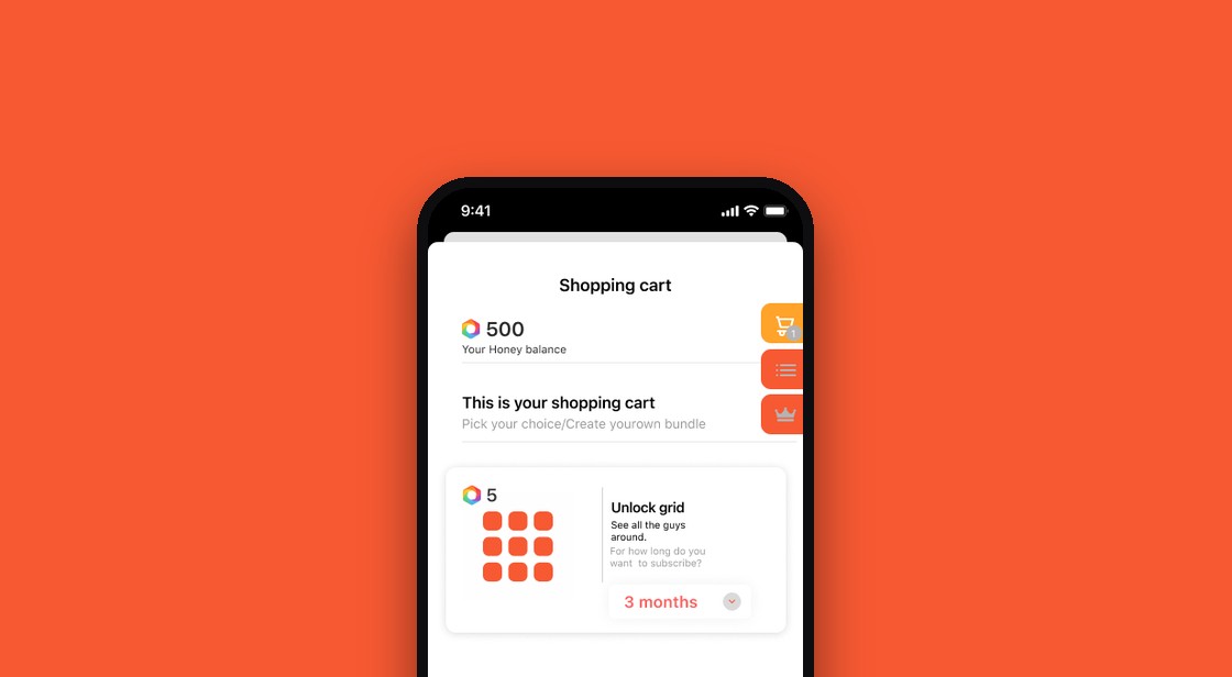
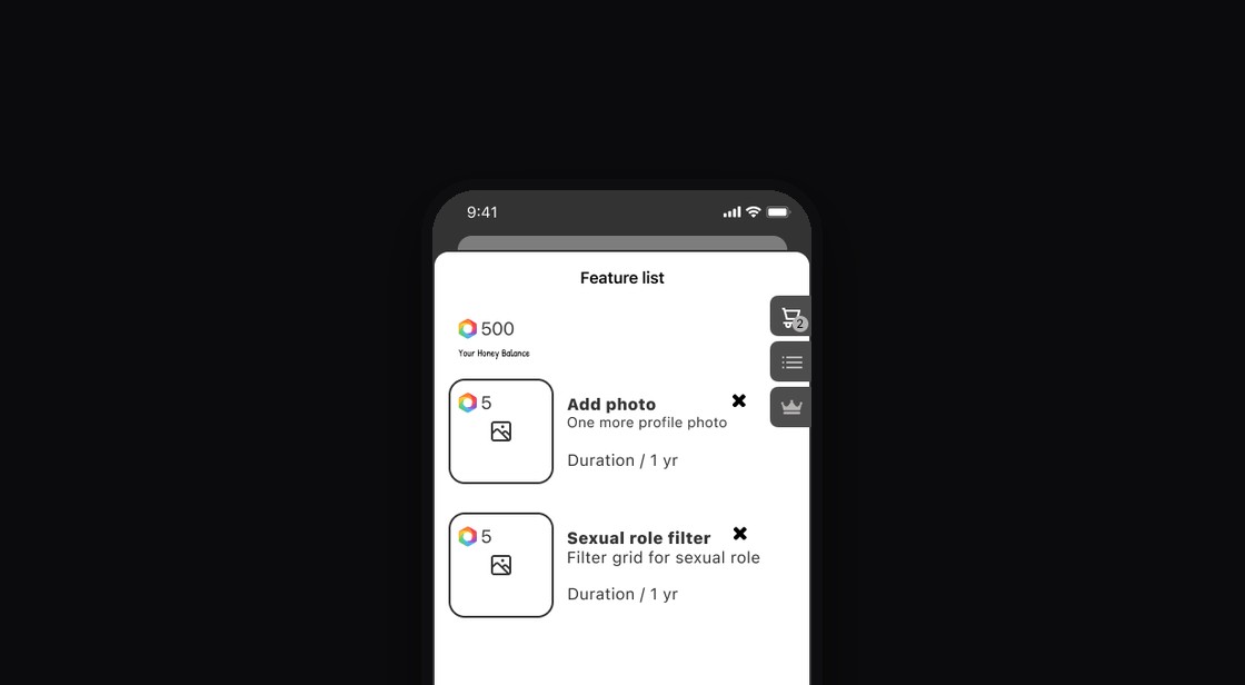
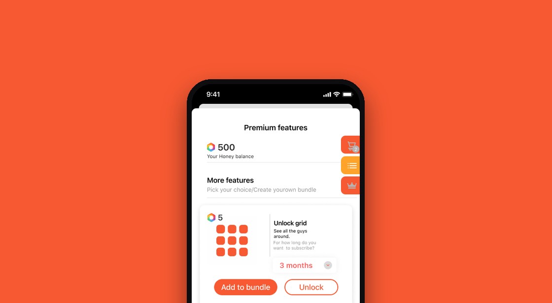
- Each feature card has two actions, Add to bundle and Unlock, a choice of duration, and a cart that shows one price per bundle.
A web app inside two mobile apps
- Problem
- The iPhone and Android apps and the web app do not behave the same way, yet the shop is a web app opened from inside both.
- Decision
- I designed one web interface that is entered from both mobile apps and still feels like part of them.
- Why
- iPhone, Android and the web app behave differently, so the handoff between the apps and the shop had to be designed.
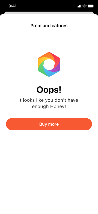
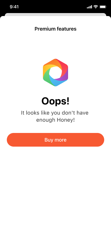
When Honey runs out
- Problem
- The person wants a feature and does not have enough Honey for it yet.
- Decision
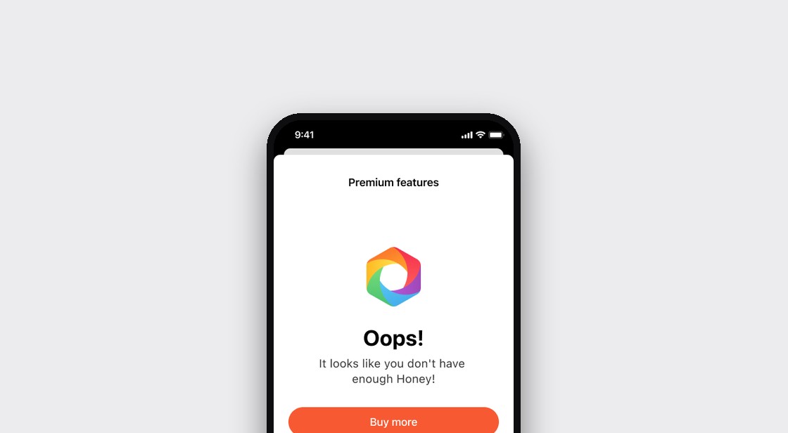
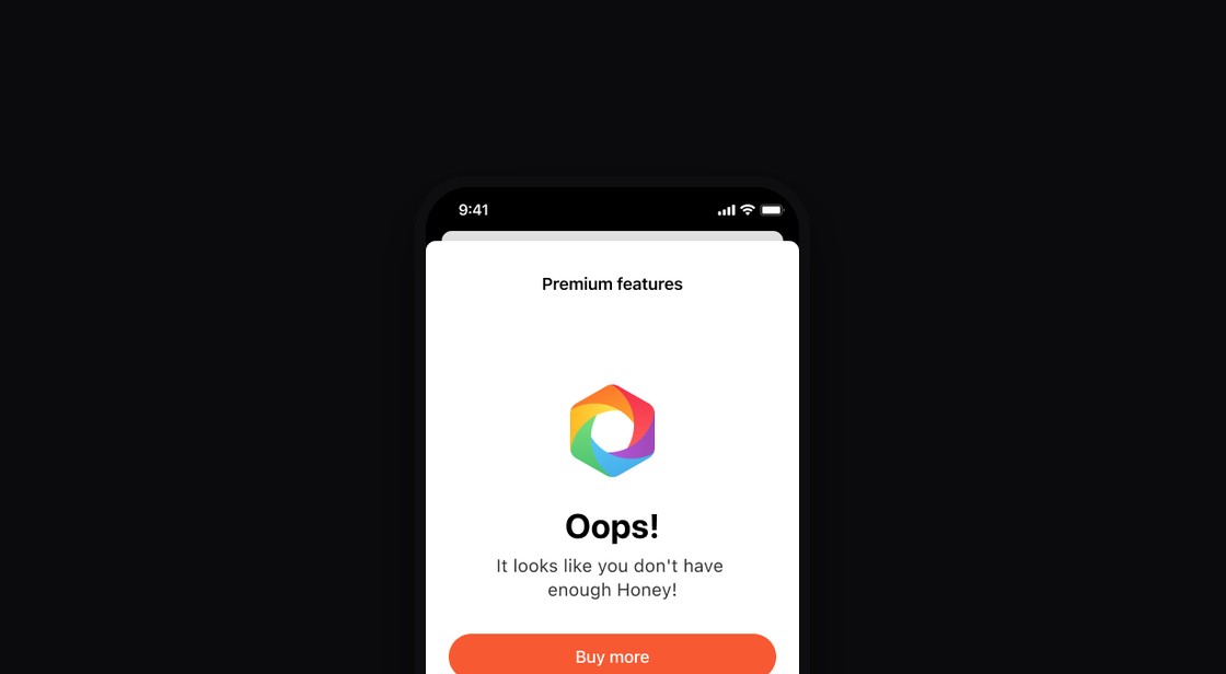
- An “Oops” screen with one clear button, Buy more, for every entry point.
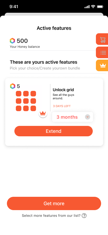
Active features: what is left, and what next
- Problem
- Members lose track of what they have paid for.
- Decision
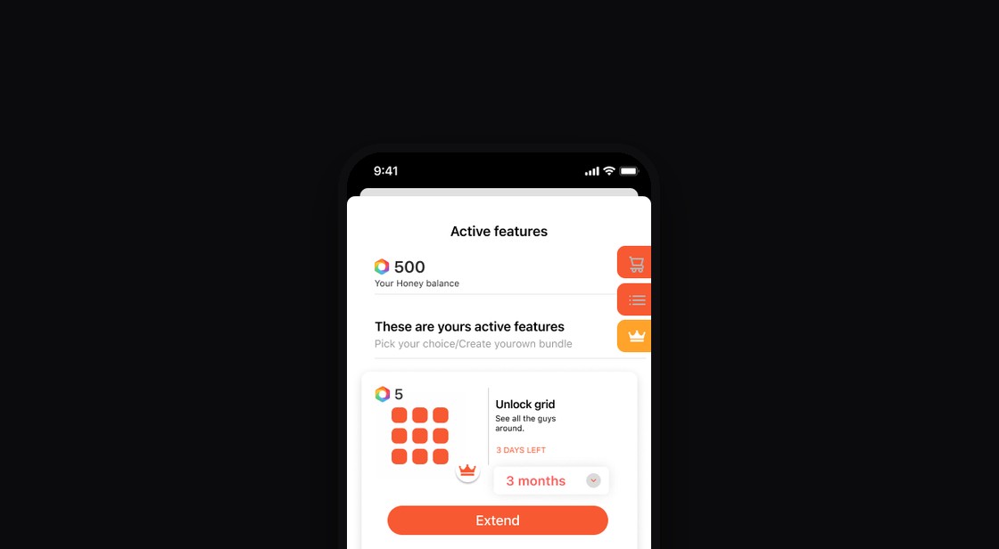
- An Active features screen with days left on each feature and an Extend action.
Hi-fi, key states
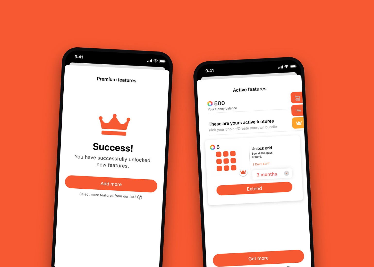
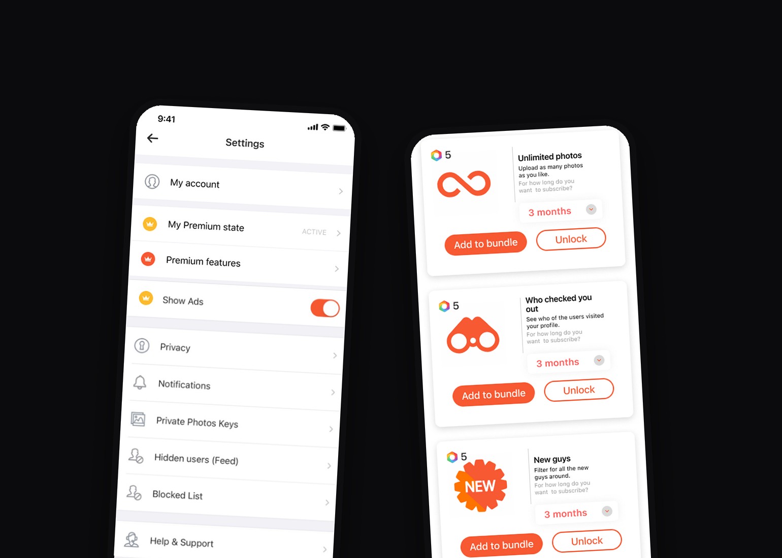
The ethical bit.
Some of the paid features are filters on sensitive attributes, such as sexual role and relationship status. A mechanism that asks for Honey after the third use is exactly where I should say how I thought about the line.
- Mechanism
- First uses free, then Honey.
The idea I dropped.
The web app did not want to behave.
The hardest conversation was about platforms. iPhone, Android and the web app do not work the same way, and the shop had to be a web interface entered from inside both mobile apps.
I went through every screen with the lead developer and the web team, who told me what was possible and what was not. The product manager protected our time next to regular work, so it could ship.
Did it work?
increase in Honey purchases.
From first flows to final screens
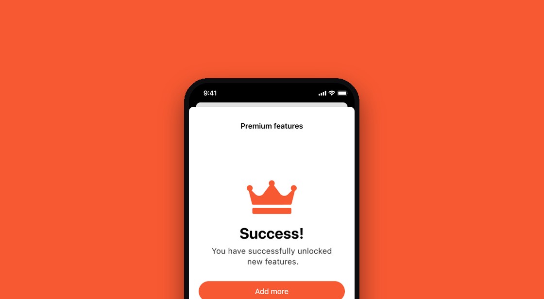
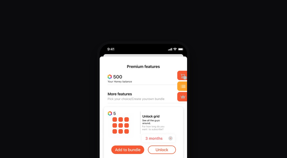
From alpha to the store.
Hornet ships through separate builds. The feature went to alpha and beta testers with QA first, and only then out to the store as an update. First the 10+ QA testers, then members who sign up to test early versions. QA checked that it worked, prototype tests checked whether people understood the flow, and alpha and beta checked it in the real app.
It has been live for about three years, and my screens are still in use.
Would I change it?
What still holds up: my screens are still in use, and the team still ships in the pattern I designed. I had a great team. Some people researched, some tested, some read the analytics and told me who spent how long on which screen, and I added my own analytics work on top.
What I have not evaluated is how it performs today. What I would check now, country by country: how different types of members behave and how much time they spend talking. A small app section can teach you a lot about people.
Honest limits.
This study shows depth and ownership, not people management. I led through influence, with analytics, QA, developers and the growth and revenue lead, and did not manage a team here.
One icon, everywhere in the app.


The short answers.
ScopeDid you start the project or get a task?
The idea came from the growth and revenue lead. I shaped it from paper to production.
Proof in the study: Hook, Role
ScopeHow many people, and for whose work were you responsible?
I was responsible for the design of the whole feature. Nobody reported to me.
Proof in the study: Role
StrategyWhy this problem?
Finance wanted fast revenue, and the data showed which free features people used most.
Proof in the study: Hook, Insights
ResearchWhere did the insight come from?
Competitor and previous-store review, analytics by feature and country, QA and user tests.
Proof in the study: Insights, Options
DecisionsHow did you convince others?
Five or six flow meetings and a tested prototype of the wireframes.
Proof in the study: Options, Collaboration
ResultsDid it meet its goal, and how do you know design was the cause?
Honey purchases rose 37%+. Growth after launch does not by itself prove that design caused it.
Proof in the study: Result
MistakesWhat did not work, and what would you change?
I would change little.
Proof in the study: What did not work, Reflection
LeadershipDid you lead a team?
I led by influence, not authority, on this project.
Proof in the study: Role, Limits